The Peabody Memphis
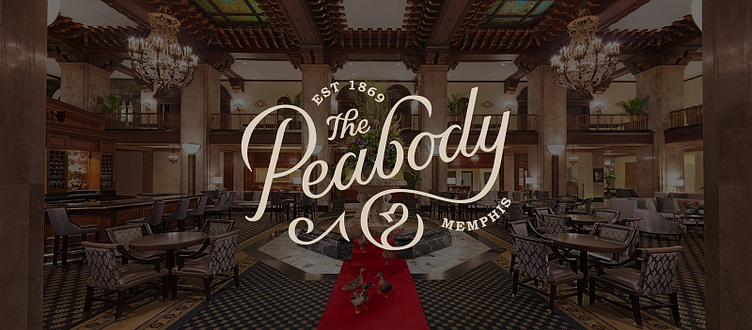
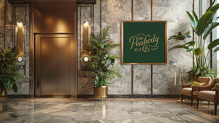
The Peabody is a hotel located in Memphis, Tennessee. It is know as the “South’s Grand Hotel” and is world-famous for its five resident Mallard ducks, who march daily through the lobby at 11am and 5pm.
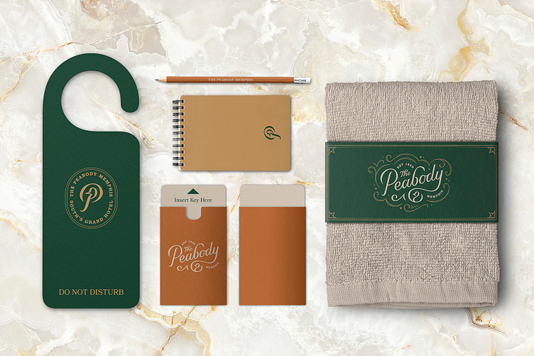
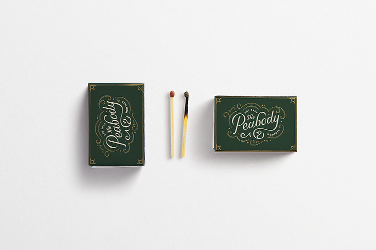
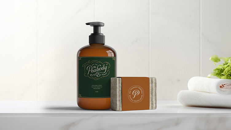
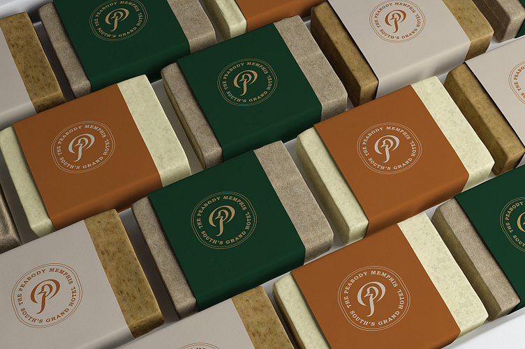
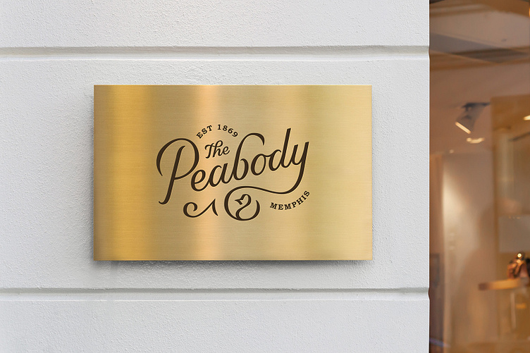
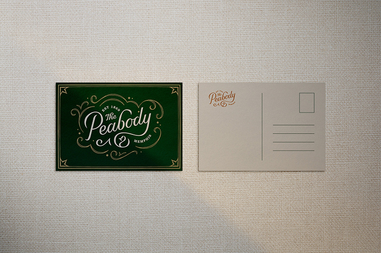
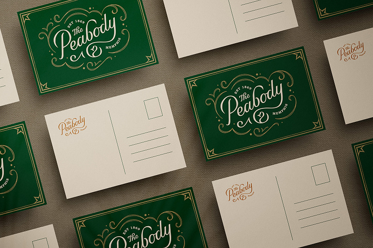
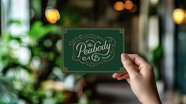
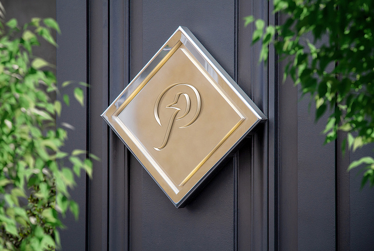
In this redesign, I wanted to lean into the heritage of this 1869 hotel with a distinctly vintage aesthetic. The script, the pattern, the lockups, are all vintage inspired. I decided to honor the script of the original logo but hand lettered a few modifications. The color scheme is inspired by the ducks that have their home at The Peabody and the duck silhouette is also embedded in both the logo as well as the icon.
I wanted the package design of this brand to work across a wide variety of products. For this reason, I employed a flexible illustrated border and a swirl pattern of varying widths. The goal of it all was to complement the shape of the logo and to frame it out against the background. For a more vertical layout, I also developed an icon with the hotel’s name and tagline.
Designing for a hotel brand is all about enhancing the experience of the guest. It should feel luxurious, effortless, and timeless. Visiting the Peabody Memphis is a distinct and memorable experience and hopefully this new branding reflects that.