What's the Scoop
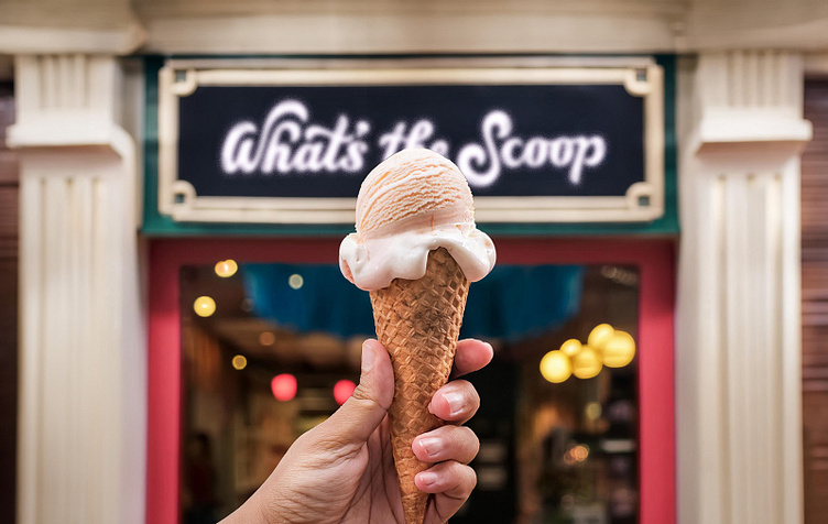
What’s the Scoop is a ice cream shop in located in Metuchen, NJ. Because all of their ice cream is home-made, I wanted to bring a much more hand-drawn aesthetic to their identity. The lettering within the logo is chunky, flowy, and creamy, exactly the kind of consistency ice cream should have. The words are not entirely even and slightly off-kilter, adding to the playfulness of the brand. There is also a small ice cream cone hidden in the apostrophe of the mark.
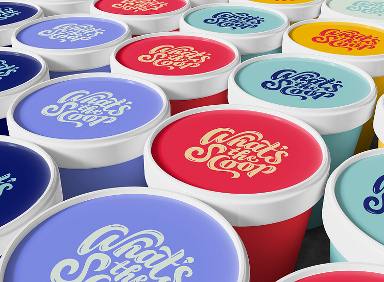
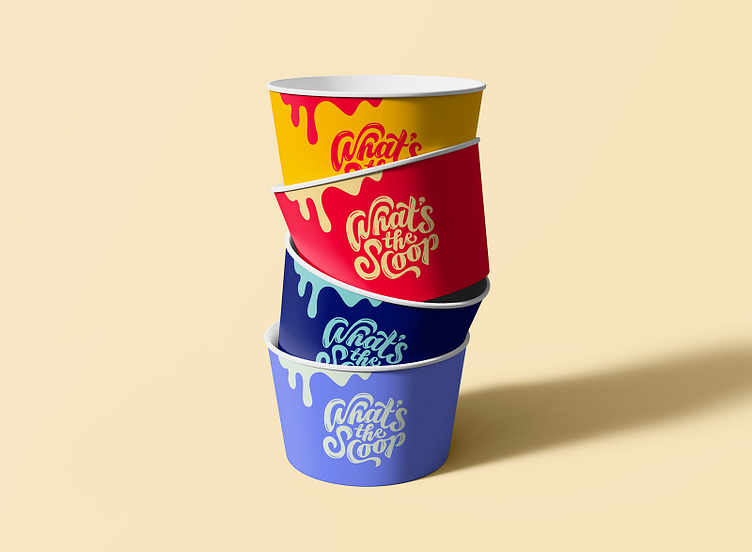
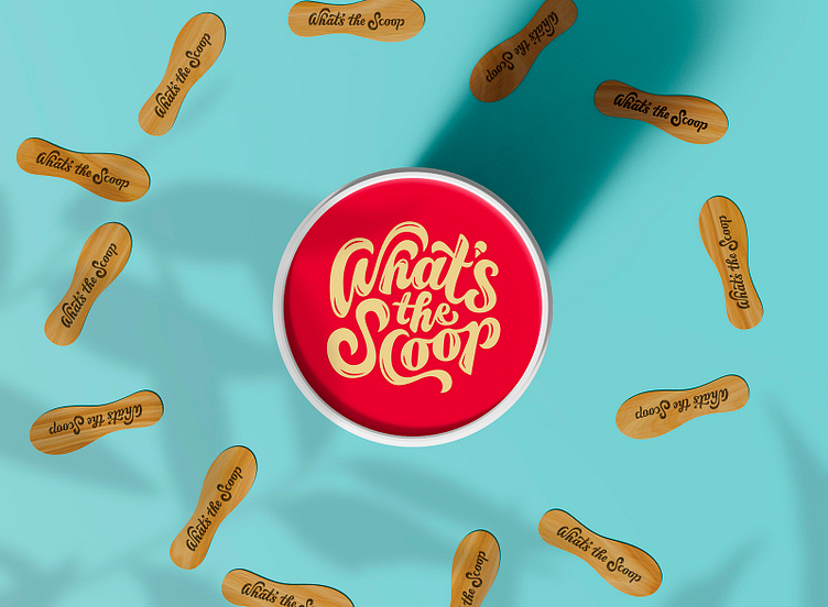
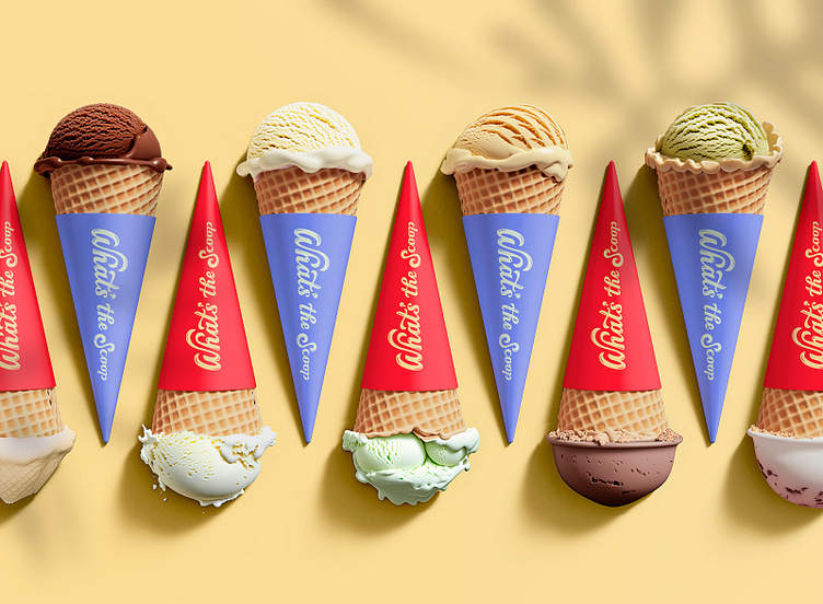
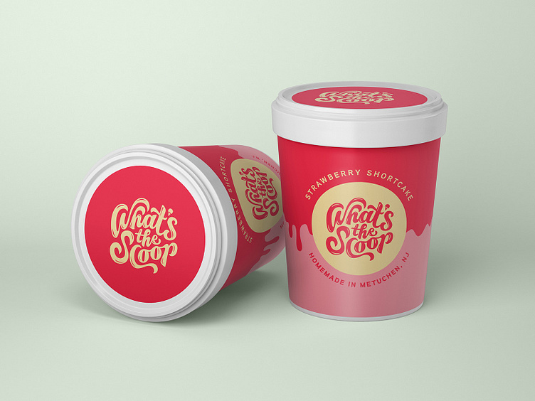
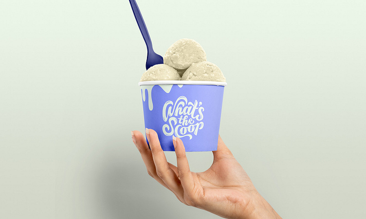
I wanted the package design for What’s the Scoop to be simple to allow the product, the logo and the color palette to shine. For the cups, I kept it pretty clean with a slight melted effect at the top. The cones have a horizontal logo lockup swirling vertically across. The containers are slightly more detailed. Because the logo is relatively circular, putting it inside the shape of a melting cone seemed like the ideal solution.
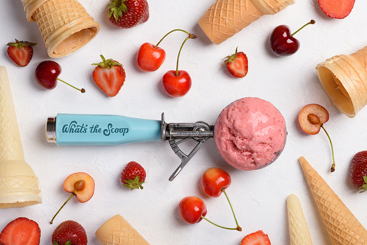
The color scheme for this brand is bright and cheerful, providing ample contrast for a variety of flavor options. I didn’t want to choose anything too pastel, the goal of this color palette is for it to feel like summer all year round.