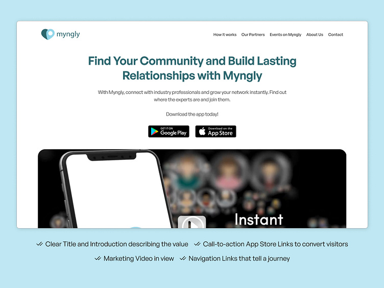
Hero Section Redesign for Professional Networking App
Did a product design audit last week. Decided to revamp the company's website hero as well. Here are some of my recommendations:
- Added CTA to download the app
- Added heading & intro text
- Enhanced nav bar with relatable info
Below is the old design. You need to capture your visitor's attention the moment they land on your site or else you lose them as a user.
More by Nabil Ahsan View profile
Like

