Brand Identity for Dodo Socks
Quick Intro 🧦
This project showcases the development of a brand identity for Dodo Socks. The design aims to convey the brand’s vibrancy, playfulness, and modern approach through a colorful and minimalist style.
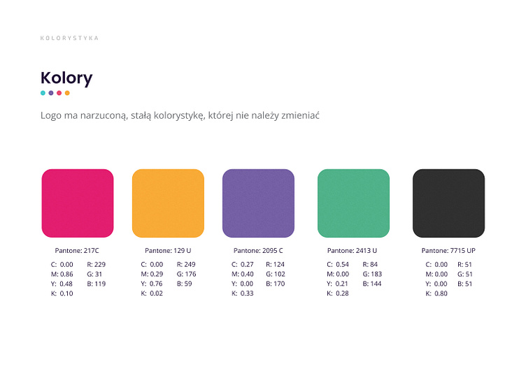
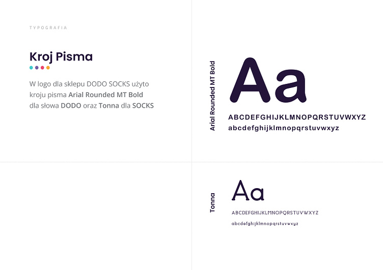
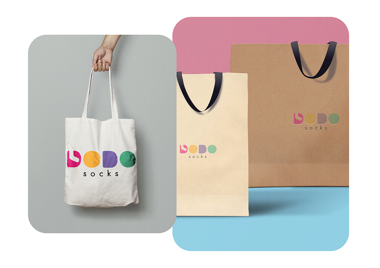
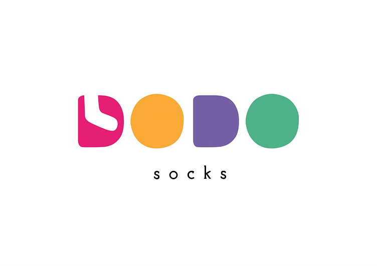
The logo forms a bold, geometric form spelt out in "Dodo." It portrays the selected forms in wide-ranging colors that represent diversity, creativity, and dynamic energy. The minimal typography further reinforces its modernist and clean design.
