Gurucul Rebrand + Case Study
Gurucul, a cybersecurity leader, empowers Security Operations Center (SOC) and Threat teams with tools that enhance clarity, enabling them to focus on reducing risks and controlling costs. Gurucul sought a new brand identity that reflects this commitment and breaks away from typical cybersecurity branding.
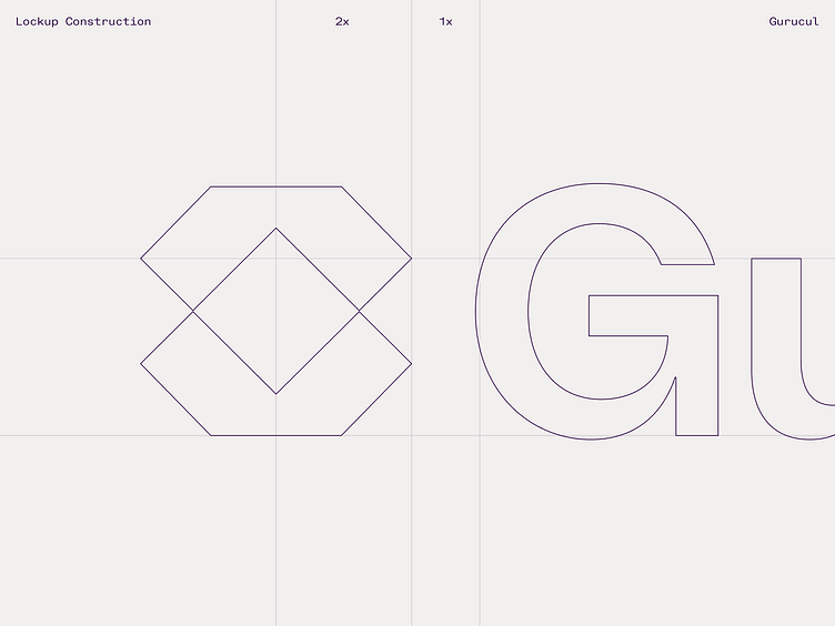
Gurucul’s commitment to delivering true clarity to its customers isn’t just talk—they act on it. This led us to their core brand idea: Radical Clarity. Born from this concept, Gurucul's logo includes a symbol that's formed by two intersecting diamonds—reinforcing the concept of clarity.
Check out the case study here: https://jaredgranger.com/Gurucul
——
Are you looking for help with your branding? I'd love to hear from you!
Email me: hello@jaredgranger.com