Zendenta - Brand Book for a SaaS Dental Clinic Management System
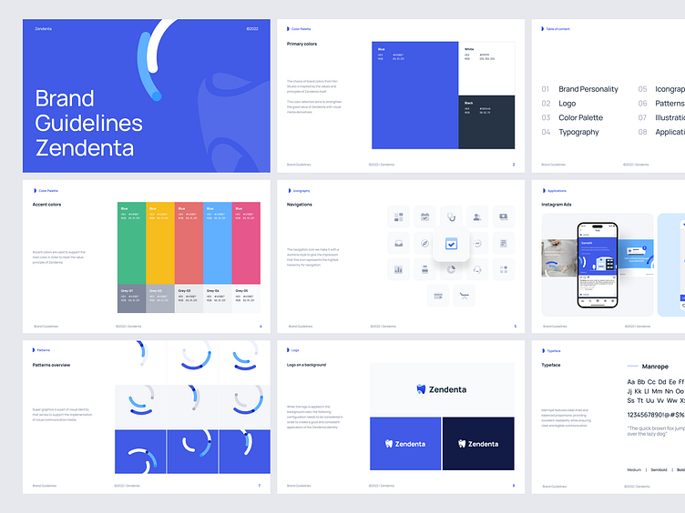
The Zendenta Brand Book is a comprehensive guide designed to unify the visual and messaging identity of the SaaS Dental Clinic Management System. This brand book lays out clear guidelines on everything, ensuring consistency across all touchpoints. By providing a cohesive framework, it empowers to create a seamless and professional brand experience.
Check out an Zendenta showcase on our Behance
Check out a full Zendenta case study on our Website
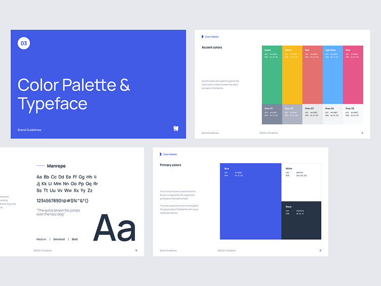
The brand uses a primary color scheme dominated by a rich blue, complemented by accent colors to enhance visual variety while maintaining consistency across the brand's communications. The chosen typeface, 'Manrope,' offers a modern and clean look, with various weights to ensure versatility in different contexts.
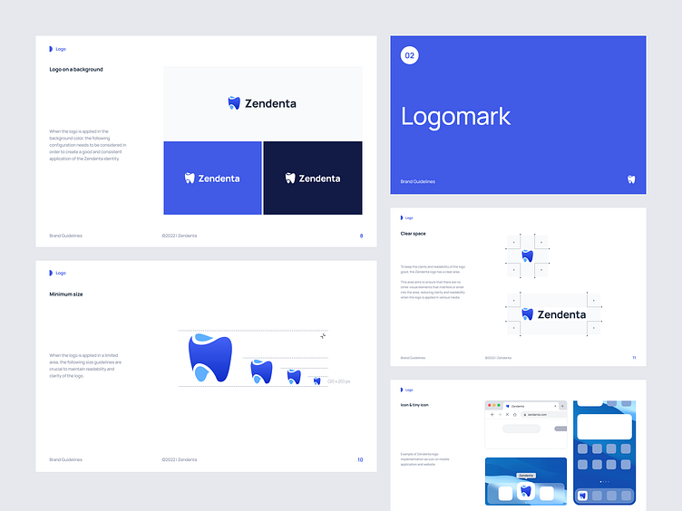
The logo, featuring a stylized tooth, serves as the core visual representation of the brand, symbolizing trust and care in dental services. The guidelines outline the minimum size and clear space requirements to ensure the logo remains legible and visually effective in various contexts. Additionally, it demonstrates how the logo adapts to different backgrounds, maintaining its integrity and impact across platforms.
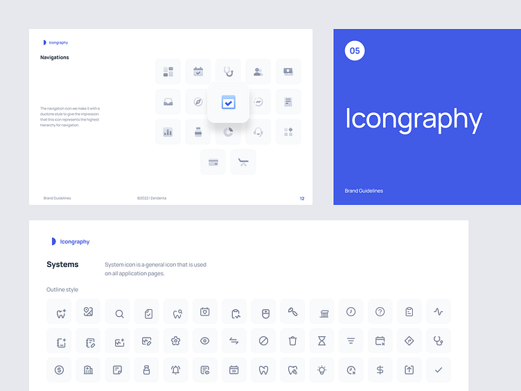
The iconography system is a refined balance of simplicity and function, designed to seamlessly integrate into any user interface. Each icon follows a clear outline style, ensuring consistency across all application pages while providing intuitive visual cues. The use of a duotone style for navigation icons establishes a clear hierarchy, guiding users effortlessly through the interface.
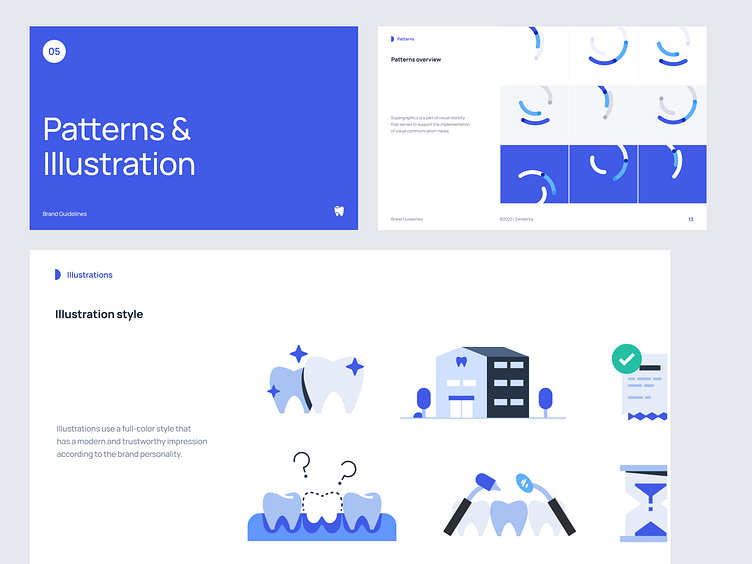
Patterns and illustrations in this design language carry a modern, trustworthy vibe that aligns perfectly with the brand's personality. The carefully crafted supergraphics serve as a visual foundation, supporting various communication media. The full-color illustrations, characterized by clean lines and minimalistic shapes, create a cohesive look that not only catches the eye but also fosters a sense of reliability and approachability in the user.
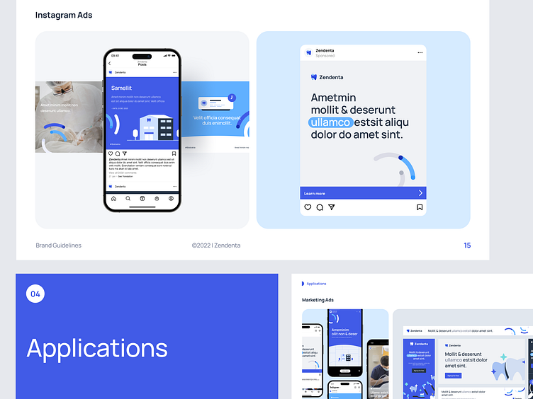
The use of consistent visual elements, from icons to illustrations, extends seamlessly into marketing ads, creating a unified brand presence across all platforms. The integration of these design principles in digital ads, such as those on Instagram, reinforces the brand's identity, making it instantly recognizable.

Have a SaaS project in mind?
We assist SaaS entrepreneur to design and build their product, with dedicated team. Drop us a message at Contact us
Client's Recommendation