IcyEats Delivery App
Onboarding Flow
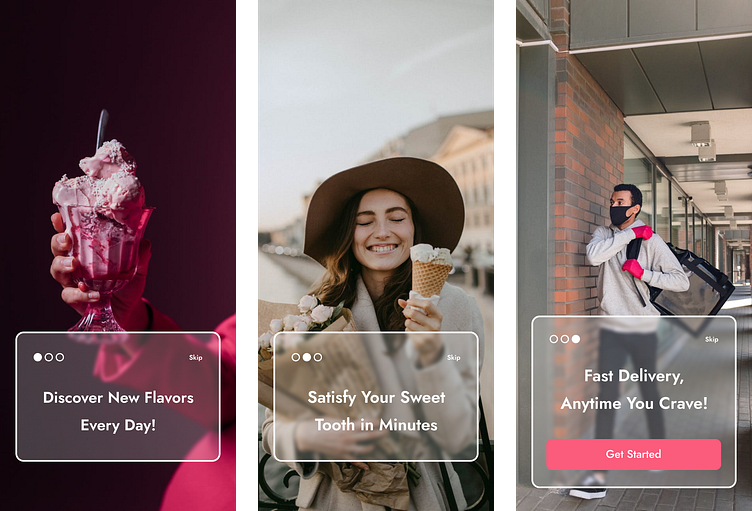
Welcome Screens: The user is introduced to the app with three consecutive welcome screens. Each screen features a full-screen background image and a central rectangle displaying a catchy headline.
Transition Effect: A smooth fade transition occurs between each screen.
Skip Option: Users have the option to skip directly to the last screen.
Final Welcome Screen: This screen also features a full-screen background, a catchy headline, and a prominent "Get Started" call-to-action (CTA) button.
Sign-Up Flow
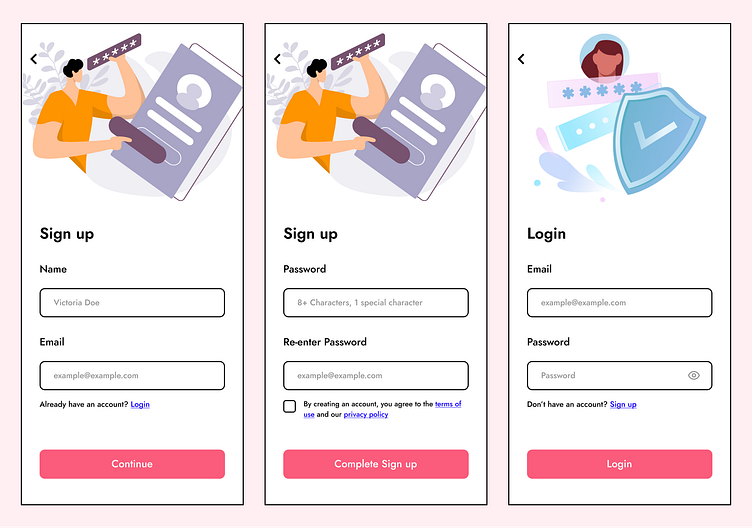
Initial Sign-Up Page:
- After clicking "Get Started," users are directed to the sign-up page.
- Elements: The page includes an illustration, input forms for the user's name and email, a link to log in for existing users, and a CTA button labeled "Continue."
Login Option:
- If users choose to log in instead, they are redirected to the login page.
- Elements: This page features an illustration, input forms for email and password, a link to sign up for new users, and a CTA button labeled "Complete Login."
3. Password Setup page:
- After clicking "Continue" on the initial sign-up page, users proceed to set up their password.
- Elements: The page includes an illustration, input forms for creating and re-entering the password, a checkbox to agree to the terms and conditions, and a CTA button labeled "Complete Sign-Up."
Home Page
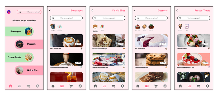
Home Interface:
- Upon successful login or sign-up, users are brought to the home page.
- Elements: The home page features the user's avatar, a search button, and four clickable rectangles representing the app's categories: Beverages, Quick Bites, Desserts, and Frozen Treats.
- Navigation Bar: Located at the bottom of the screen, the navbar includes icons for Home, Menu, Cart, and Profile.
Menu Browsing
- Category Menus:
- Clicking on any of the category rectangles takes users to the respective menu.
- Elements: The menu page includes a back icon, a search bar, icons for sub-categories (e.g., Milkshakes, Beverages), and a selection of top picks presented in rectangles with images, product names, review percentages, and category icons.
Product Details
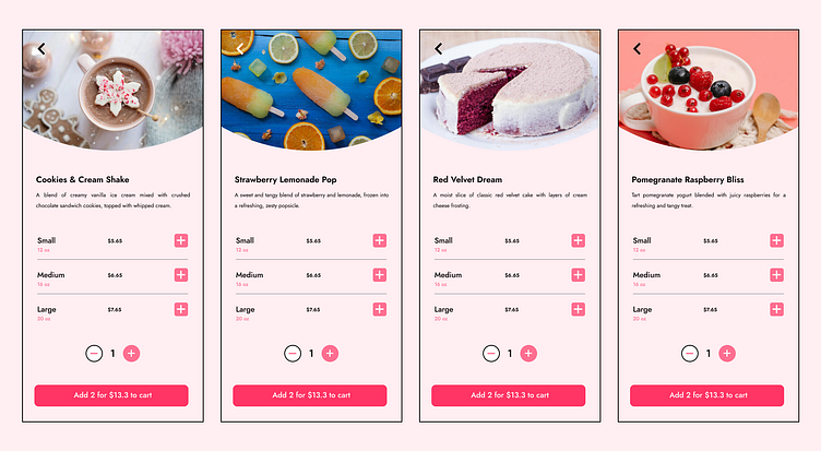
1. Product Page:
- Selecting a product from the menu leads to a detailed product page.
- Elements: The page showcases a large product image, the product name and description, available portion sizes (Small, Medium, Large), prices, an option to adjust the quantity, and a CTA button to add the item to the cart.
- Cart Update: A pop-up confirms the item has been added to the cart, and the cart icon in the navbar updates to reflect this.
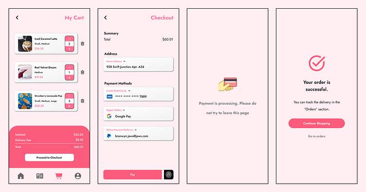
1. My Cart Page:
- Accessing the cart via the navbar opens the "My Cart" page.
- Elements: This page lists the items in the cart, subtotal, delivery fee, total amount, and a CTA button labeled "Checkout."
Checkout Page:
- Clicking "Checkout" directs users to the checkout page.
- Elements: The page displays a payment summary, an address selection dropdown (Home or Work), and three payment options: Credit/Debit Cards, Digital Wallets, and Online Payment Platforms. Each option includes a dropdown to select a specific service (e.g., Visa/Mastercard, Google Pay/Apple Pay, PayPal/Venmo).
- Payment Action: A CTA button labeled "Pay" is accompanied by a fingerprint icon for an alternative payment method.
3. Payment and Confirmation:
- After initiating payment, a loading animation is displayed while the payment is processed.
- Success Notification: A pop-up confirms the order has been successfully placed, with options to "Continue Shopping" (return to the home page) or "Track Order" (via a link to the Orders section in the user's profile).