It's in the computer!!
Don't do a whole lot of Identity work so would love some feedback on this.
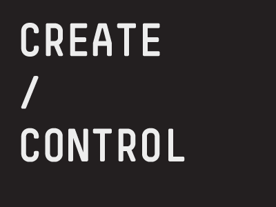
It's for a new division of a record label. Brief was to be 'clean and modern' so I went with the idea of having it look like a user had just typed it out. Going for a 'big brother' / '1984' feel with the 'control' aspect of the name.
More by Glenn Thomas View profile
Like
