Design System for a Mobile App 🧩
Hi Dribbblers! 👋🏀
Mastering Design Systems in Figma: The Details Matter 🚀 🧠
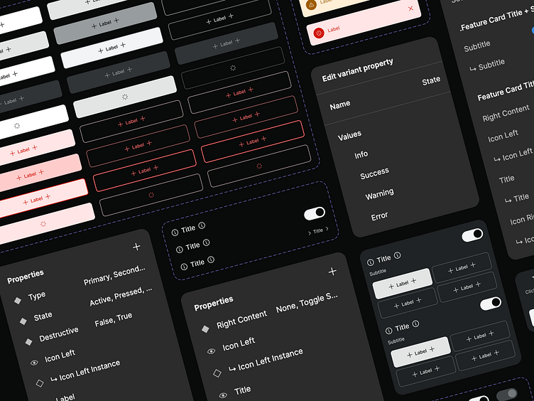
Creating a design system or UI kit in Figma involves more than just assembling components—it's about building a framework for consistency, scalability, and efficiency.
Here are key practices I always need to consider:
💥 Auto-Layout: Essential for making components responsive and adaptable, reducing manual adjustments.
💥 Spacing & Labels: Consistent spacing and labels enhance visual hierarchy and user experience.
💥 Style Guides: Define your typography, colors, and components early—this keeps your designs cohesive.
💥 Pinning Styles: Pinning ensures that any style updates automatically sync across components.
💥 Components & Variants: Use and name components' properties wisely (e.g., Button/Primary/Active). Clear and universal naming simplifies navigation and collaboration. Avoid detaching to maintain consistency.
🔍 Think of your design system as a language—each component and variant is a word. A clear, consistent language ensures better communication and design efficiency. Investing time in these details upfront pays off in the long run by saving time, reducing errors, and delivering a seamless user experience. A well-maintained design system is key to building products that not only look great but work effortlessly.
------
💥 Do you like our work? Press “L” for love! We’re available for new projects. Tell us more at withintent.com.