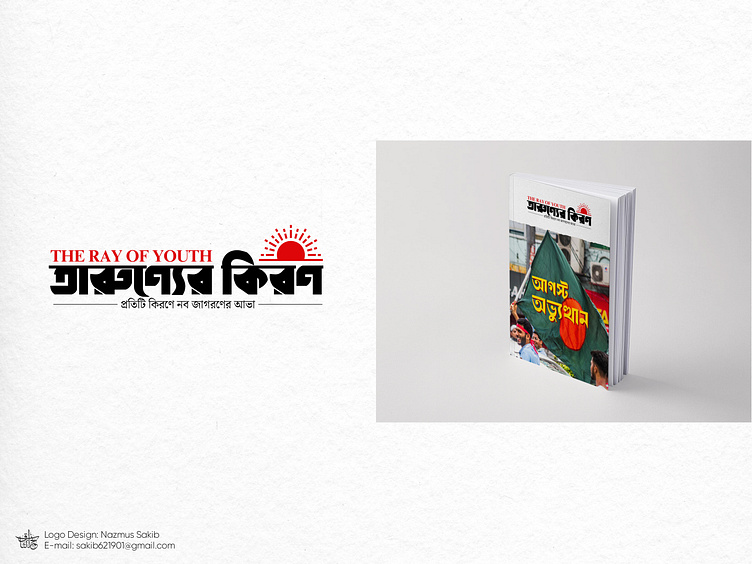
The Ray of Youth Magazine Logo
Logo Design: ‘তারুণ্যের কিরণ’ (The Ray of Youth) Magazine
I had the privilege of designing the logo for the half-yearly magazine ‘তারুণ্যের কিরণ’ (The Ray of Youth), a publication dedicated to capturing the vibrant energy and innovative spirit of today’s youth. The goal was to create a visual identity that resonates with the magazine's mission to inspire and empower its readers, while also reflecting the dynamic and forward-thinking nature of its content.
Design Concept:
The central symbol in the logo is crafted to represent the radiance and promise that each ray of youth embodies. This aligns seamlessly with the magazine’s slogan, “প্রতিটি কিরণে নব জাগরণের আভা” (In Every Ray, the Glow of a New Awakening), which speaks to the themes of new beginnings, growth, and the boundless potential of youth. The design is a visual metaphor for how the magazine serves as a beacon of inspiration, shining light on fresh ideas and perspectives.
Process & Execution:
Creating this logo involved a comprehensive and meticulous design process. From initial sketches to the final product, I focused on ensuring that every element of the logo was meaningful and aligned with the magazine’s vision. I explored various design iterations, carefully considering typography, color schemes, and symbolism to deliver a logo that is both striking and deeply resonant with the magazine’s identity.
Final Outcome:
The completed logo not only stands out visually but also enhances the magazine’s overall brand identity. It effectively communicates the magazine’s dedication to illuminating new paths and fostering a spirit of innovation among its readers. The design was met with enthusiasm from the magazine's editorial team, who appreciated how well it encapsulated their vision and mission.
Key Features:
Logo Concept: A rising sun, representing youth, energy, and new beginnings.
Typography: Strong and modern, with a bold black and red color scheme.
Slogan Integration: The magazine's slogan is seamlessly integrated into the design, adding depth and meaning.
I am proud of the final result and how it contributes to the magazine’s identity. I would greatly appreciate any feedback or suggestions on this project as I continue to refine my design skills. Please feel free to review the entire project in my portfolio for a more in-depth look at the process and outcome.
Contact:
Designer: Nazmus Sakib
E-mail: sakib621901@gmail.com
Facebook: www.facebook.com/nazmus.sakib03
LinkedIn: www.linkedin.com/in/nazmus-sakib03
Behance: www.behance.net/nazmus-sakib03


