Real Estate Single Page
A dive into the intricacies of designing a real estate UI!
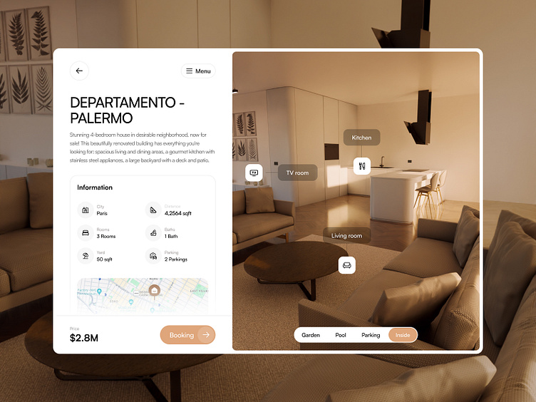
Welcome to revisit Dream Abodes from a different angle, focusing on the property detail page. In designing this page, we’ve decided to organize property information on the left and accompanying visuals on the opposite.
This layout, combined with the use of descriptive icons and concise information facilitates comparisons between houses. The map underneath the information box adds another layer of practicality when using this website.
To further improve the user experience, we’ve implemented image tags designed as icons with verbal descriptions. This thoughtful approach ensures that users can easily identify key features of each property.
Need the most effective solutions in UI design? Let us guide you at hi@abron.co.
