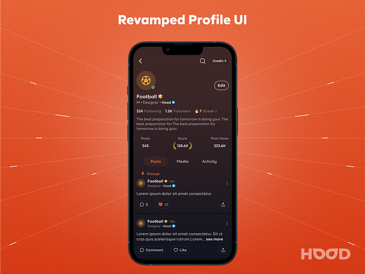
Revamped Profile Page - Hood
Some context about Hood
Hood is a new-age Anonymous social network that allows users to share their true stories without the fear of being judged.
Before implementing the new profile UI, I created these two designs, which were also live in the product. However, as the product requirements changed, the design now needs an upgrade.
Early Stage UI (2022):
The interface was simple, with few options or statistics available, so I designed it in the simplest way possible. At that time, we also had the option to connect with Twitter, which granted users a verified tick. However, after some consideration, we decided to remove the Twitter connection feature for various reasons.
Old UI (2023 to July 2024):
As the app evolved, we introduced gamification elements like scores and badges to boost user retention, which proved highly effective. We also expanded the app's functionality by adding more statistics and a media section. Despite these enhancements, I ensured the design remained uncluttered and user-friendly.
Current UI (August 2024 to Present):
While implementing the streak feature as part of the new product requirements, I took the opportunity to redesign the profile screen. The "User Score" became the focal point of the profile, and I emphasized it prominently. This redesign not only aligned with the new feature but also significantly improved the overall user experience.
Do you like what you see?
Get in touch: souravsrivastava123@gmail.com • Linkedin


