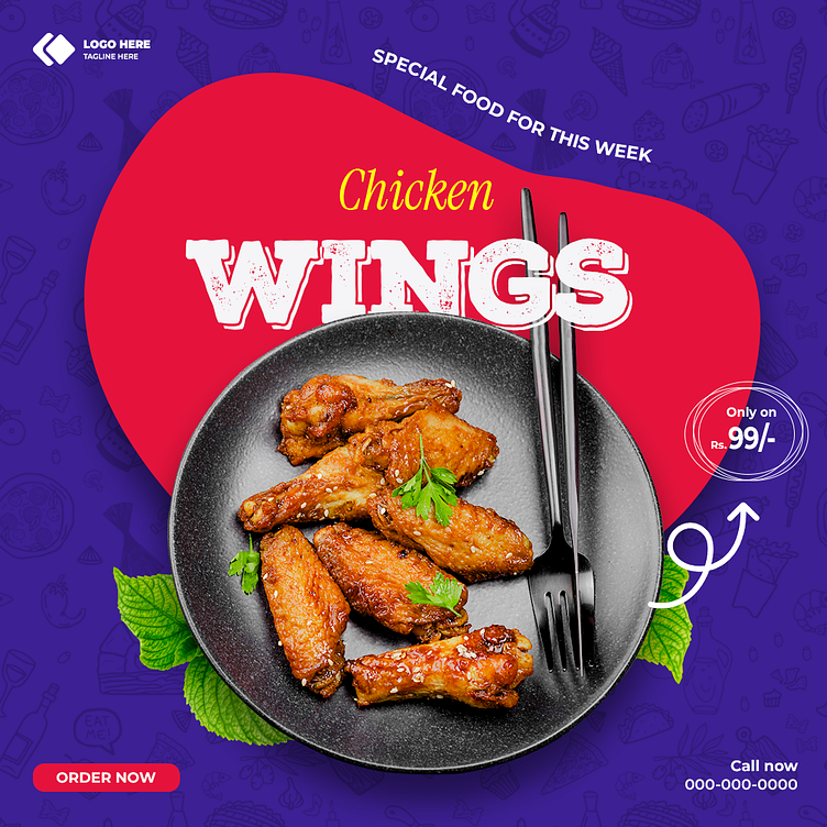
Chicken Wings - Special Weekly Food Offer Ad Design
For this design, my goal was to highlight the deliciousness and value of the weekly special—Chicken Wings. I chose a bold color palette with vibrant red and deep blue to make the design eye-catching and dynamic. The layout is clean yet impactful, with the dish taking center stage, framed by a playful red shape that draws attention to the offer.
I focused on creating a balance between the food's visual appeal and the promotional elements. The typography is strong and legible, ensuring that the key details like the price and special offer are immediately noticeable. The subtle use of background patterns adds depth without distracting from the main focus. This design encapsulates a sense of urgency and delight, inviting viewers to indulge in a tasty and affordable treat.
You can watch the process video on Instagram here.
If you enjoy this, please connect with me for more innovative designs!
