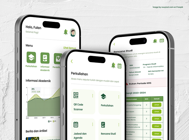
KALAM - University Education Information System Mobile App
About This Project
Backstory & Purpose:
KALAM (Academic and Mobile Information Services) is a super app for all administrative needs, academic services, and information that can be used by +30,000 academics consisting of lecturers, students, and education staff at UIN SGD Bandung (data for the 2022/2023 academic year).
This is a final project I created as a graduation requirement for obtaining a bachelor's degree. I helped the UIN SGD Bandung Information Technology and Database Center (PTIPD) develop version 2.0 of the KALAM application.
I act as a UI/UX Designer, taking a User-Centered Design (UCD) approach that involves starting from the User Research stage to obtain user response data and testing the results before entering the development stage.
Problem:
The UIN SGD Bandung campus has many separate services to complete various campus needs. This makes it difficult for users to remember many passwords and open different services for each need.
Based on data from APJII in 2021-2022, 89.03% of internet users in Indonesia are accessing the internet using smartphones, so creating a good application on a mobile platform will follow user needs.
Solution
1). User Research:
From initial research on 25 KALAM users, data was obtained that almost more than 43% considered the KALAM version 1.0 application not to have complete features, not running well, and not being a solution to administrative problems.
The results of distributing the User Experience Questionnaire (UEQ) revealed that out of 6 UEQ assessment variables on similar services, SALAM only received "Below Average" and "Above Average" scores in both the lecturer module and the student module.
The results of Card Sorting revealed relevant insights from cards containing assumptions of the right features, such as 24 cards in the student module and 22 cards in the lecturer module. In addition, users' aspirations were also collected, especially those that had not been accommodated on the card.
The Card Sorting result can be seen HERE (Student module).
2). Sitemap:
Based on the insights gained in User Research, I created a Sitemap explaining that this mobile application requires 17 sections in the student module and 14 sections in the lecturer module.
In both modules, the sections are dissected in more detail. For example, the lecture section of the lecturer module will have subsections for employee information systems and academic calendars. The student and lecturer modules have 82 and 57 subsections, not including the content/details of each.
The Sitemap can be seen HERE (Student module) and HERE (Lecturer mobile).
3). Wireframe:
After learning the content needed for each section, I created a wireframe to sketch the website's appearance. Up to 153 screens are for students, and 104 screens are for lecturer modules.
In the Wireframes, conditions that users will face are also visualized as similar as possible, such as the appearance of capital to display light information, alerts when deleting data, and others.
User flow is created for each section in both the Student and lecturer modules to map the application usage flow that the user will pass. The User Flow can be seen HERE (Student module).
The Wireframe can be seen HERE (Student module) and HERE (Lecturer mobile).
4). Hi-Fi & Prototypes:
After getting approval from the final project supervisor and PTIPD UIN SGD Bandung, I continued to develop the Hi-Fi design from the existing Wireframe, including 219 screens on the student module and 134 screens on the lecturer module.
Before developing Hi-Fi & Prototype, I created reusable and effective design system components, including a color palette, text style, buttons, etc.
Based on the university's color guidelines, the green color palette gives the impression of KALAM, a university app with Islamic, professional, and fresh branding.
The Prototype can be seen HERE (Student module) and HERE (Lecturer mobile).
5). Development & Testing:
After the previous process has been completed, 3 experts with rich experience in the UX field will be conducted to assess and provide suggestions regarding application design development using the Heuristic Evaluation method.
Final Testing is conducted by users (students and lecturers) using the UEQ method. The KALAM version 2.0 design result received a better rating than the existing version 1.0 by getting the predicate "Good" or "Excellent" on six variables.
The KALAM mobile app can be downloaded HERE.
For connections, portfolios, or projects/collaborations, you can find me on Dribbble or other platforms (Instagram, LinkedIn, & TikTok) via linktr.ee/ilhamf08. Thank you!


