Wise River Realty - Direction 3
Wise River Realty Direction 3
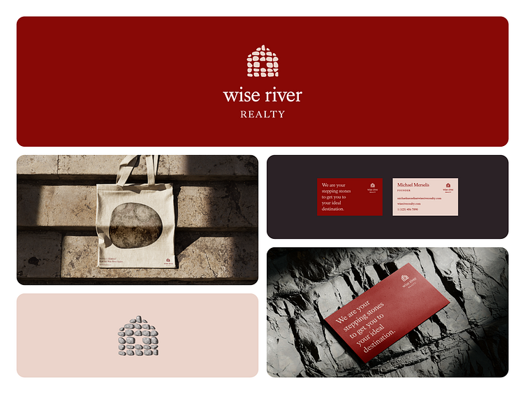
I really liked this concept of using stones/rocks and gestalt principles to form shapes such as a house for the logo.
This could work well with other shapes such as different shaped houses, buildings, trees, rivers and creeks, landscapes, etc.
However, I actually chose to instead focus not on what the stones/rocks create, but rather the stones/rocks themselves because that is arguably even more important.
You can't have the big without the small!
This also made the idea of Wise River Realty being a stepping stone in the process of home ownership related tasks such as selling and buying a home, reparing a home and maintenance such as repairment, cleaning, or renovating the furniture and Fenshui of a room, and more an easier idea to get across.
I also think the very bold red color, which was narrowed down to this one out of a couple dozen different tones, shades, and saturations of red, fits perfectly for such a company, but I don't blame Michael Merselis for going in a more cool, green direction. How do you like this shade of red? I think it is very deep but bright enough to feel welcoming and not too pretentious.
Hopefully, you appreciate this exploration of how a realty company might look and feel and that you learned something from my work.
Need a proper brand identity?Contact me: hello@patricktuell.com or at patricktuell.com
#logo #logodesign #logodesigner #brand #branding #visualidentity #design #graphicdesign #graphicdesigner #freelance #freelancer #designagency #minimal #simple #clean #abstract #bento #grid #layout #print #printdesign #digital #digitaldesign #realty #realestate #realtor #montana #bozeman
