Landing page of a IT based organization's website
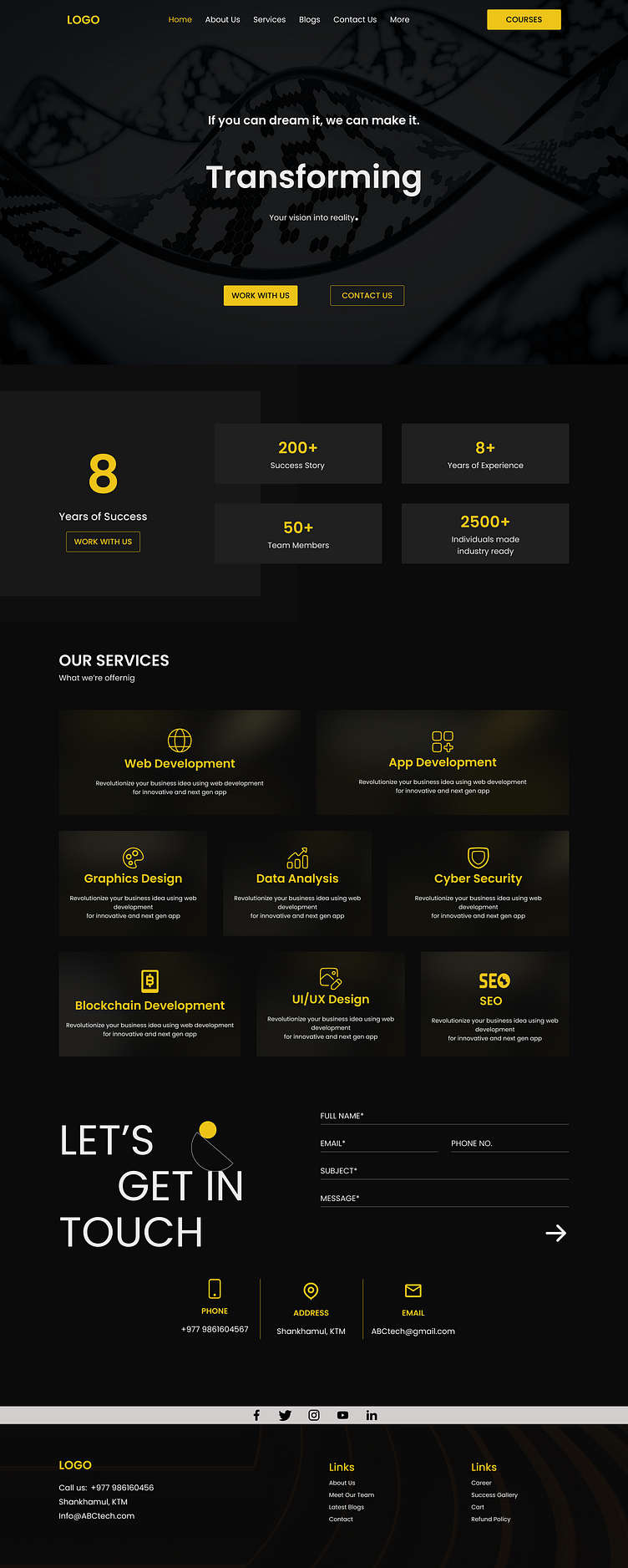
Redesigned a landing page of a site giving it dark theme for sophistication and visual appeal while reducing eye strain and improving contrast for key elements like headlines and calls to action. The minimal use of illustrations and clean design prevent visual clutter, aligning with modern aesthetics. Glassmorphism adds a contemporary, stylish touch with its translucent effect, and the bento-style grid layout organizes content effectively, making it easy to navigate and engaging. Together, these choices create a premium, user-friendly experience that highlights essential information and maintains focus, ensuring both visual impact and functionality.
