DailyUI#011: Flash Message
✨ Daily UI Challenge #011: Success & Error Messages ✨
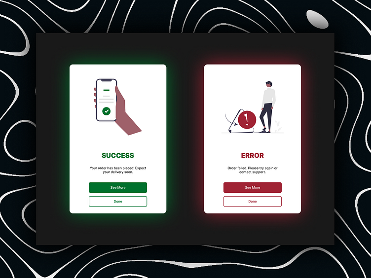
In this design, I focused on creating intuitive and visually distinct success and error states for a mobile-based ordering system. The goal was to craft a clean, user-friendly interface that clearly communicates the outcome of the user's action—whether it's success or failure.
Success Screen: I opted for a positive green tone with a confirmation icon to give users immediate feedback that their order was placed successfully.
Error Screen: On the other side, the error message is framed in red with an illustration that subtly conveys the need for corrective action, helping users feel guided rather than frustrated.
Consistency in color, typography, and messaging are key in this design, ensuring users can quickly distinguish between the two states while maintaining the app's visual identity.
📩 Let’s bring your ideas to life! I’m currently open for freelance opportunities. Reach out to collaborate on your next project!
