IQ Designs
IQ Designs: Smart Connections, Brilliant Designs.
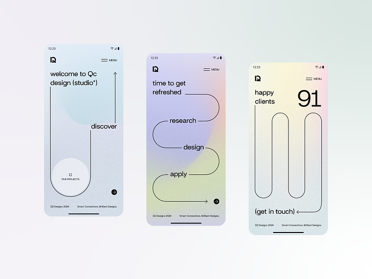
IQ Designs is a concept for a design studio mobile app that helps clients and agencies find each other.
Tinder for designers? Why not! With IQ Designs, clients can browse through a variety of design studios and software houses. The screens I designed showcase a studio's introductory profile, allowing clients to easily connect if they're interested. Clients can also browse through a studio's portfolio, where each project is broken down into particular phases of design and implementation, giving a clear view of the studio's approach and capabilities.
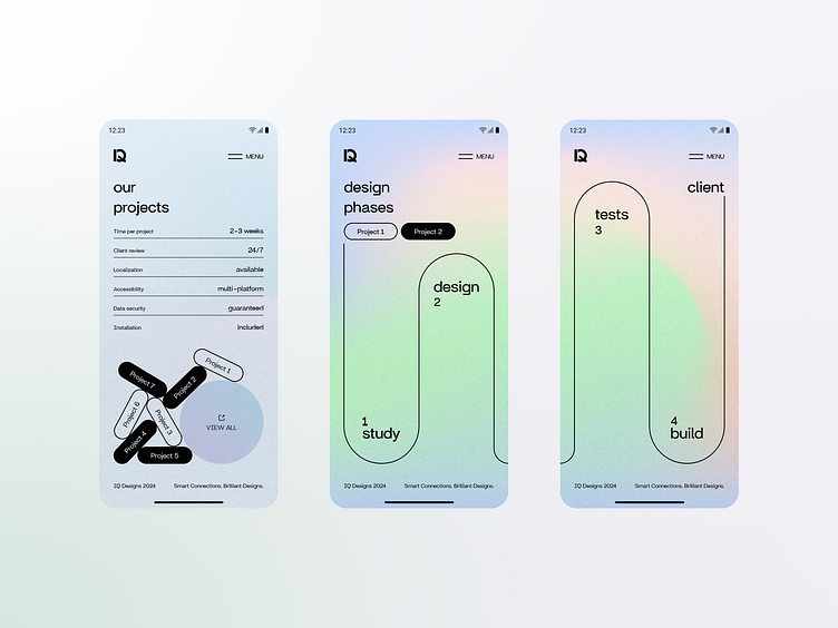
For the color palette, I paid special attention to the background. I wanted each screen to be unique yet consistent throughout the app. I ultimately chose a delicate, pastel palette with a silver grainy gradient overlay, creating a final effect that draws comparisons to pearls. For the primary font and component colors, I kept things as simple as possible, using mostly grayscale to maintain a clean and focused look. The font selected for this project is Britanica - a simple, sans-serif typeface with geometrical descenders.
The app's design is meant to be modern, minimalist, and eye-catching. The use of oversized typography and wire-like components is intended to grab attention, guide the user's eye, and encourage them to scroll for more while keeping only the key information in focus.
For more designs visit: https://qcdesign.pl
