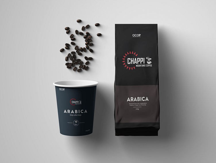
Chappi Mountains Coffee Packaging Redesign
I modernized the 90s packaging of "Chappi Mountains Coffee" while keeping its original personality intact. The redesign features a minimalistic approach with a sans-serif typeface, lots of white space, and a strong visual hierarchy. The color palette—60% black, 30% chocolate, and white typography—captures the essence of the brand. Although I focused on simplicity, I recognize that omitting CTA or accent colors was a missed opportunity.
More by M. Ammar View profile
Like

