Crafting a Clean Notifications Experience
Crafting a Clean Notifications Experience
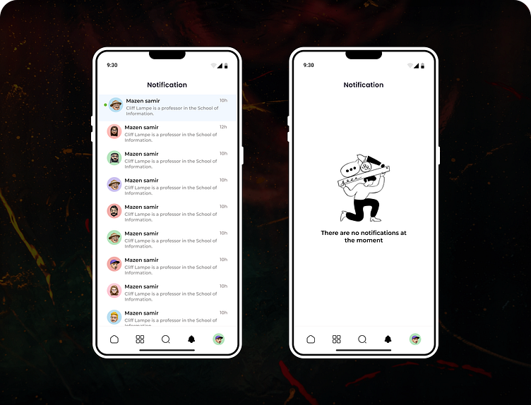
Here's a fresh take on the Notifications screen for a mobile app, balancing clarity and functionality. On the left, you see a list of notifications, each with a clean layout, consistent icons, and a user-friendly design that emphasizes readability. On the right, the empty state screen is displayed, featuring a playful illustration to keep the interface engaging, even when there are no new notifications. This design keeps the user experience seamless and visually appealing.
Design Style: Minimalist, Clean, User-Centered.
More by Mazen Samir View profile
Like
