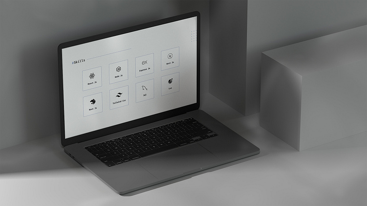
Single-page portfolio design
Creating a Minimalist One-Page Portfolio
Recently, I designed a minimalist one-page portfolio for a client, focusing on simplicity and impact.
The goal was to present their skills and work clearly, using clean design and a limited color palette.
Why Minimalism?
- Clarity: Keeps the focus on what matters most.
- Efficiency: Quick to load, easy to navigate.
- Professional Look: Simple, yet powerful.
Check out the images to see how a streamlined design can effectively showcase your work!
More by uxsolale View profile
Like


