Blog Index - Dark Mode
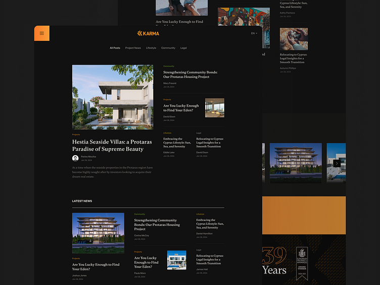
I’ve carefully adapted the Perceptually Uniform Color Palette in this dark mode design to ensure a coherent visual experience with the light mode of this design.
While this Mediterranean-inspired palette naturally aligns with the light modes, transitioning to the dark mode requires thoughtful adjustments. The copper orange plays a key role, standing out in both modes and ensuring consistency and vibrancy. Despite the challenges, the warm grays, greens, and vibrant accents still link to tradition, sustainability, and joy, making the design harmonious across modes.
