Max Ads Media
Max Ads Media is an SMMA that I worked with, the agency is very new, and I had to re-make the design 3 times, because the higher ups didn't like them, but I personally think they look pretty good...
You can judge the designs yourself.
Design 1
I thought this one was really good, but he said "It looks too similar with our competitor's website"... like, dude, just because it has the same style doesn't means it's literally the same. the image is different, the button's color and styles are different, fonts are different, even background images are different. Man, honestly.
Design 2
If I'd be honest, this one is nowhere near as good as the previous one, but it took the most amount of time, because of that isometric designs.
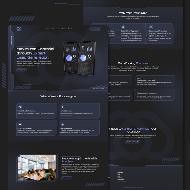
Design 3 (Final)
And finally, the last one, this has to be the best futuristic design I've ever made so far, and he liked it. I was like, "Finally! it's over!" 😂. Man, it took way too dang long for a website design.
That's it, I hope any of these designs can inspire you...


