Spine Logo Design
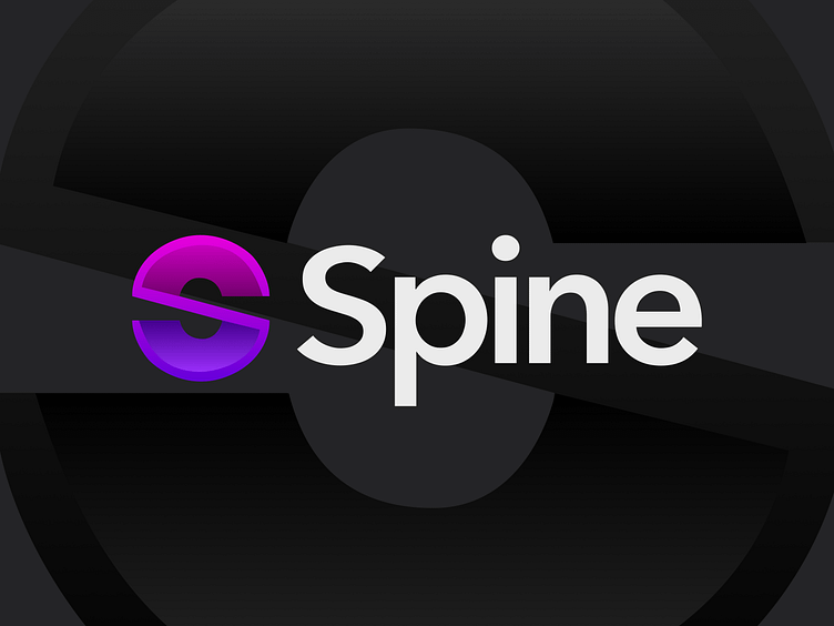
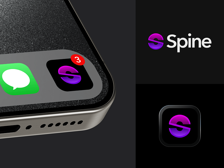
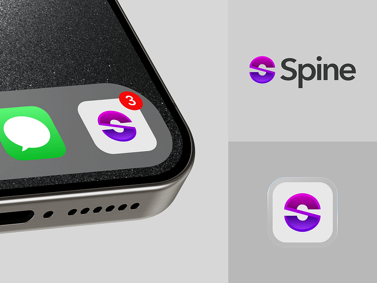
I’m thrilled to unveil the new logo for Spine, an online app that merges functionality with modern aesthetics. The design process was deeply rooted in geometric and symmetrical principles, focusing on the elegant forms of semicircles. By artfully combining two cones, we’ve crafted a unique “S” shape, which not only stands for the first letter of our brand name but also symbolizes the balance and precision that Spine aims to deliver to its users.
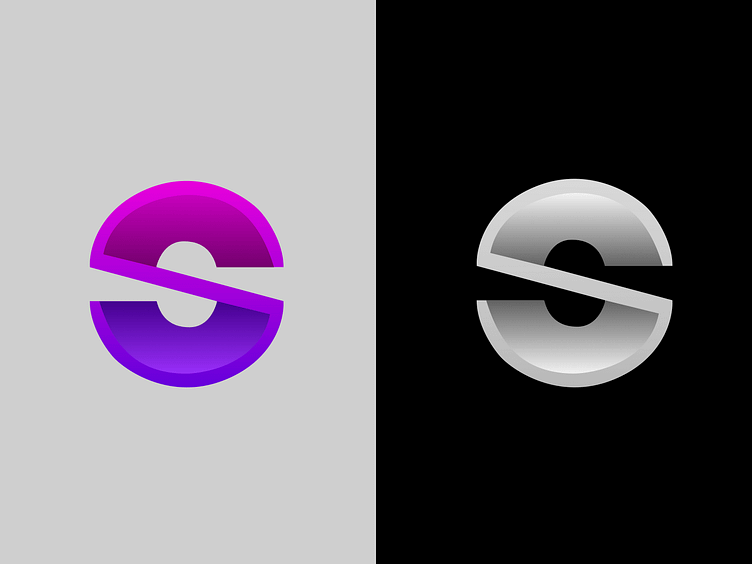
The logo is presented in both colored and monochrome versions, ensuring it maintains its strong visual identity across various mediums. The colored version features a vibrant gradient that transitions from deep purples to bright magentas, adding a sense of depth and movement to a flat 2D plane.
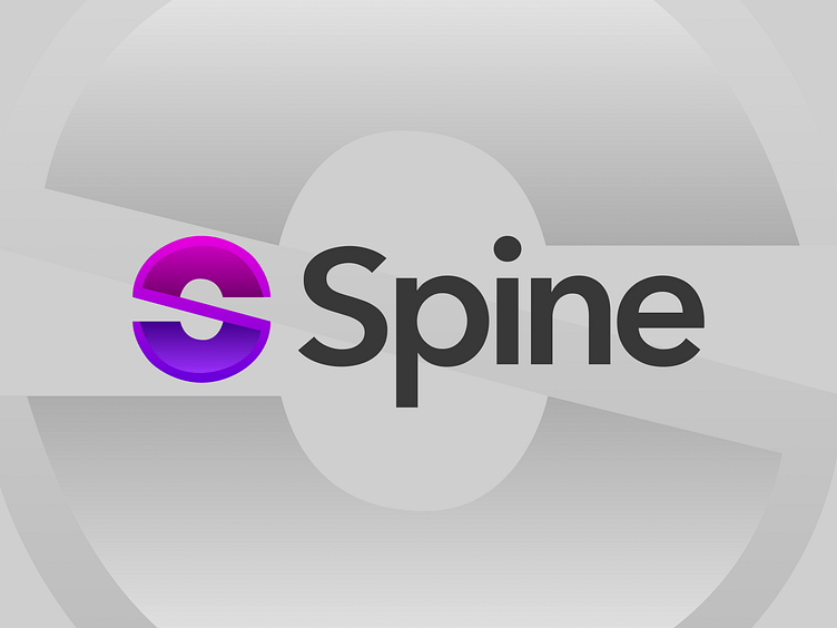
This logo was designed with versatility in mind, adaptable to a wide range of digital and print applications. Whether on a dark or light background, the logo maintains its distinctiveness and professional appeal, making it a perfect fit for the modern, sleek look that defines Spine.
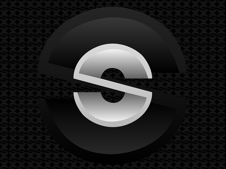
On the other hand, the monochrome version retains the logo’s sophistication and clarity, ensuring it remains impactful even in its simplest form. The strategic use of shading and highlights in this version continues to evoke a 3D feeling, proving that sometimes, less is indeed more.
Feel free to share your thoughts 👋
feel free to share your thoughts or ask questions! Your feedback is invaluable.
#LogoDesign #BrandIdentity #GraphicDesign #GeometricDesign #3DDesign #SpineApp
