Figopara Portal Redesign
Figopara Portal Redesign
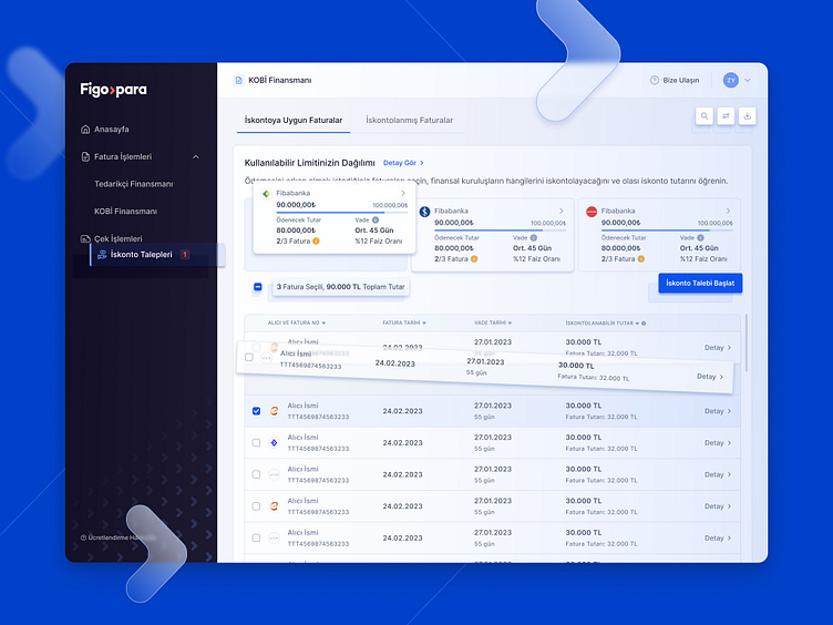
We worked with the Figopara team to redesign their vendor web and mobile Portal experience. After running in-depth user research sessions, we analysed the existing user journey, identified pain points, and crafted an expert usability report. Collaborating closely with the Figopara team, we discussed and agreed upon design solutions that prioritize user needs and preferences.
The redesign ensures seamless navigation and improved functionality across both web and mobile platforms. The redesign has an intuitive interface, streamlined processes, and visually engaging aesthetics, ultimately elevating the overall experience for Figopara's valued vendors.
🌟 Solving user needs in our extensive 300+ screen
Figopara portal project:
Clear process insight & step-by-step details 🛠️
Transparent financial info visibility 💸
Simplified on-screen guidance 📝
Instant error notifications 🚨
Bank offer timelines & approval info ⏱️
Effortless repayment tracking & timely reminders 💳


