(🛳️ Redesign 3/4) Search filters & the results page
Search filters & the search results page
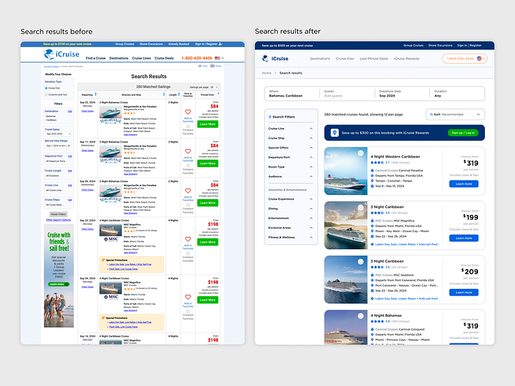
Once a user dives into search from the homepage, they can be met with thousands of search results. It's great to have options, but how can we make sure that users can quickly hone-in on their perfect cruise and start the check-out process?
Priorities for this page were:
Highlighting the funnel to the rewards program
Repeating the foundational design patterns created in the homepage
Dialing in the cruise card's information & icons
Finding a balance in the filter menu between 'useful number of choices' vs 'overwhelming number of choices'
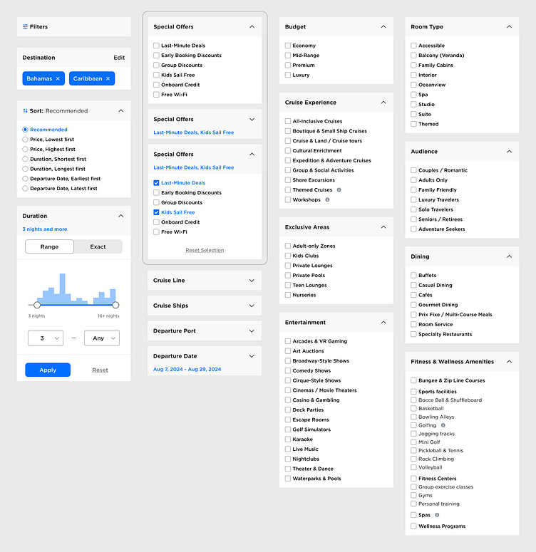
Unique search filters not found on other cruise booking websites
At the beginning of this project, I identified 8 website target audiences, each with their own set of preferences when booking a cruise.
For example:
A couple looking for a cruise might want a romantic getaway with fine dining & spa services sprinkled with some adventurous activities to enjoy
A family booking a cruise might want to ensure there are kid-friendly or teen-friendly zones with activities that all could enjoy
Meanwhile, retirees might prefer a more relaxing trip filled with cultural enrichment activities and educational workshops
I wanted to create categories and filters speak to a range of customer preferences that would help users find their perfect cruise experience (and even highlight some amenities they wouldn't even think of preferring in the process).
Pulling inspiration from some of my favorite e-commerce sites resulted in a unique set of categories & items I haven't found on other cruise booking websites.
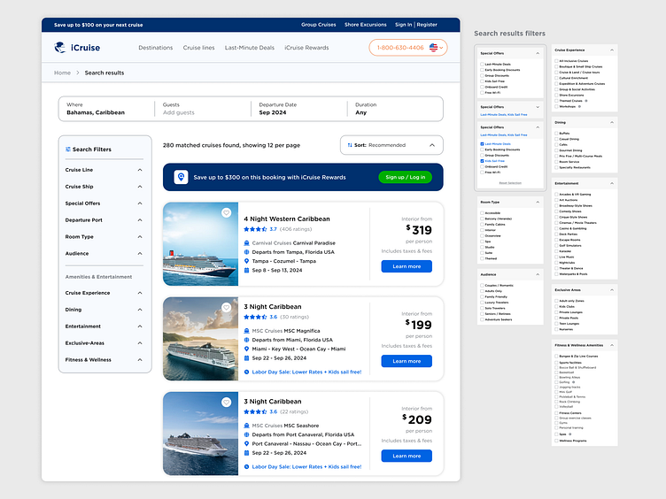
Putting it all together
With a unique set of filter categories & underlying options created, it was time to put the search results page together. In order to not overwhelm users with too many filtering options, I landed on creating a two-section filter as a left nav menu with:
The first section containing traditionally found filters found across other travel sites while
The second section housed all of the entertainment options a cruise ship might offer
The search result (cruise) card took a few iterations to complete. Between figuring out what the most critical/useful details to show, playing with icons (recreating some company logos as vectors from a PNGs), and adjusting some of the palette for accessibility purposes, I'm happy with how the result turned out. Oh, and fun fact: did you know that cruises are typically rated on a 6 star scale? I didn't.
Next up: Individual cruise details page, interaction animations for search results, & page revisions based on feedback from the website's company (!).
