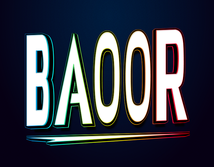
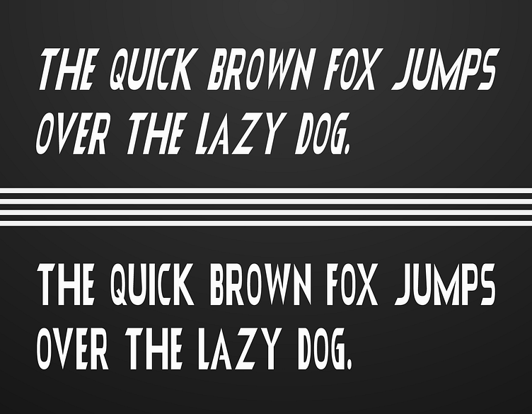
Baoor Font
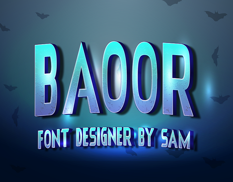
Gallery Of Baoor Font


Making of Baoor Font: A Designer's Perspective
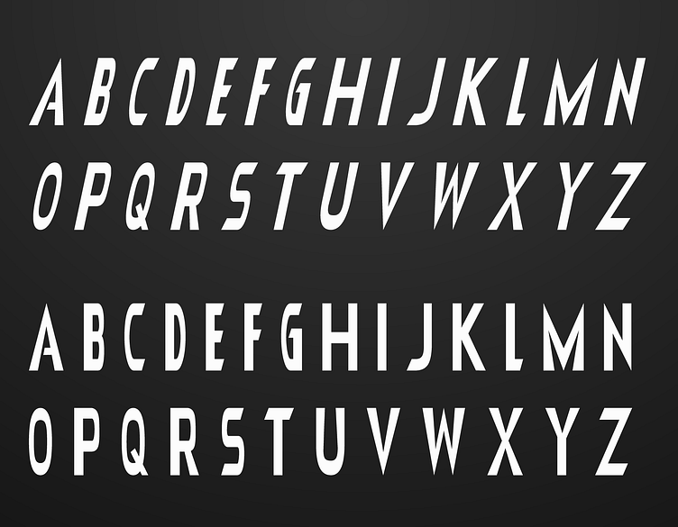
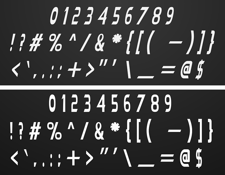
The creation of Baoor Font was a journey of exploring boldness and simplicity in typography. As a designer, I aimed to develop a typeface that would make a statement with its strong, impactful forms while retaining a clean and modern aesthetic. Baoor Font is a product of this vision, blending assertiveness with minimalism.
Concept and Inspiration
The inspiration for Baoor Font came from modern architectural elements and the idea of bold, structural forms. I wanted to create a font that could convey strength and presence, making it suitable for use in headlines, logos, and branding materials. The challenge was to balance these robust elements with a minimalist design approach.
Design Process
Conceptualization and Sketching: The design process began with sketching out the core concepts, focusing on how to create a sense of boldness and structure in each letterform. This initial phase was crucial for setting the direction of the font and ensuring that it would stand out while remaining versatile.
Digital Design in Adobe Illustrator: Once the concept was clear, I transitioned to Adobe Illustrator to start the digital design. Illustrator’s vector tools allowed me to create precise and consistent shapes, ensuring that the bold forms of Baoor Font were sharp and clear.
Emphasizing Boldness: A key characteristic of Baoor Font is its boldness. I focused on giving each character a strong presence, with thick lines and a substantial weight that makes the font highly visible and impactful. This was balanced with clean, uncomplicated shapes to maintain a modern look.
Vector Refinement: After establishing the initial forms, I refined the vector paths to ensure smooth lines and perfect balance. This step was critical in achieving the desired level of precision and consistency across all the characters, maintaining the font’s overall strength and clarity.
Kerning and Spacing: Proper kerning and spacing were essential to ensure that the font was not only bold but also readable and aesthetically pleasing. I spent considerable time adjusting these elements to make sure Baoor Font would work well across different sizes and applications.
Testing and Iteration: The final stage involved testing the font in various design scenarios and making adjustments based on feedback. This iterative process was important for ensuring that Baoor Font met my expectations for quality and functionality.
Usage and Availability
Baoor Font is available for free personal use. For commercial use, it can be obtained through Creative Fabrica. You can find it here or contact me directly at fontdesigner467@gmail.com for licensing information.
Designing Baoor Font was an exciting experience that allowed me to explore the intersection of bold design and simplicity. I hope this font brings a sense of strength and modernity to your projects and serves as a powerful tool in your creative work.
