Competitor Analyzing mobile responsive
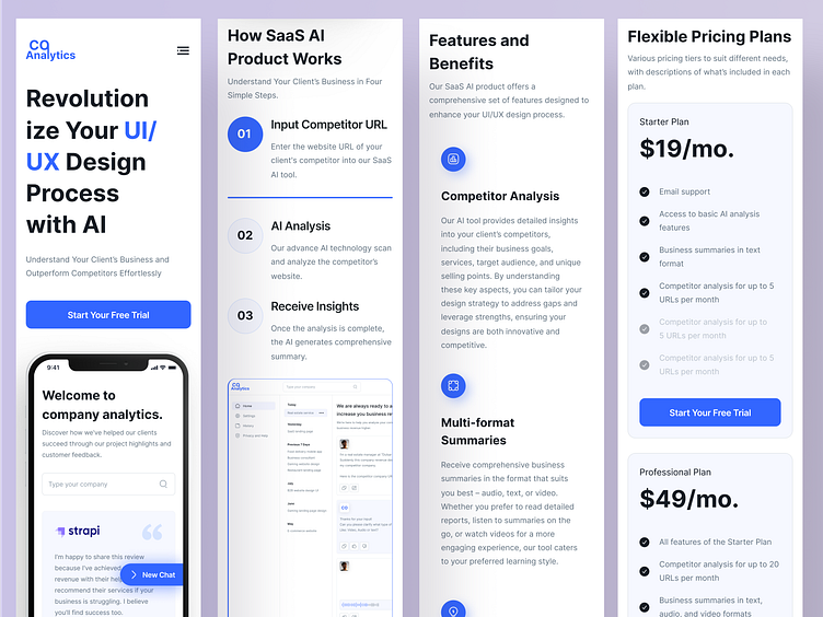
Mobile-responsive version of the "competitors analyzing UI/UX design" landing page, the design prioritizes a seamless and intuitive experience on smaller screens. The layout is optimized for touch interactions, ensuring that all features are easily accessible and user-friendly on mobile devices.
The mobile design adopts a vertical scroll format, with content sections stacked for easy navigation. Key elements, such as the competitor URL input field and the AI-generated insights, are prominently displayed, allowing users to interact with the SaaS AI product without unnecessary distractions. Visual elements, such as icons and buttons, are resized for optimal tap targets, and the typography is adjusted for readability on smaller screens.
To maintain visual appeal and functionality, animations and interactive elements are simplified, ensuring fast load times and smooth performance. The mobile design retains the clean and modern aesthetic of the desktop version, with a focus on simplicity and ease of use, providing an efficient and engaging experience for users accessing the landing page on their mobile devices.
Let's discuss your next project:
Contact Us: beetechb@gmail.com

