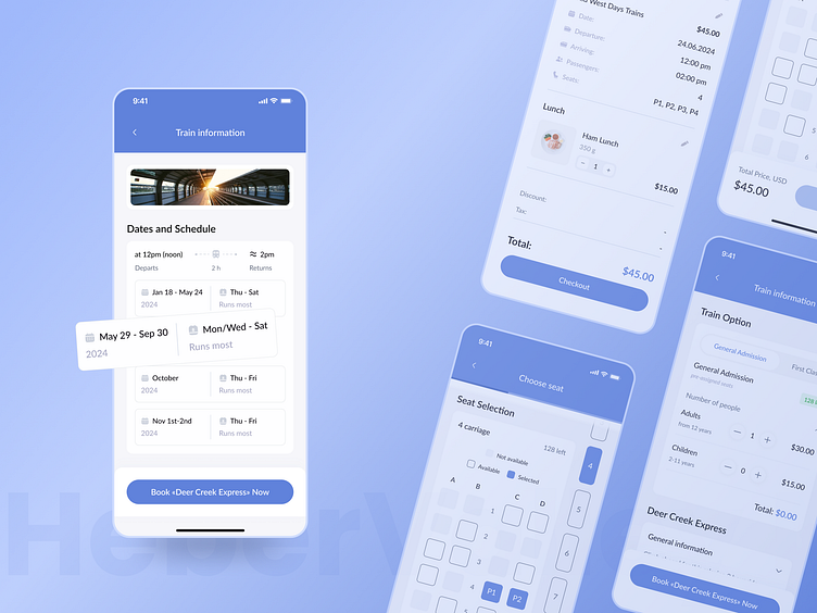
Booking app ValleyTrains
In this design, I focused on creating a seamless and intuitive interface. The clean layout and strategic use of a calming blue color palette not only boost the app’s visual appeal but also promote a sense of tranquility and trust among users. This color choice aligns perfectly with the travel theme, providing users a visually relaxing experience as they plan their journeys. 🎨✨
This project is a testament to thoughtful UI/UX design aimed at simplifying online train booking while catering to the diverse needs of modern travelers. It’s all about making travel planning as enjoyable and stress-free as the journey itself. Let's ride towards more innovative solutions together! 🌟🚂
For a touch of customization, users can select their seats and meal options directly within the app. This feature not only enhances user engagement but also gives a clear and detailed overview of available options, ensuring they can make the best choices for their travel needs. The integration of scalable icons and responsive buttons enhances functionality across various devices, ensuring a great user experience whether on a phone, tablet, or desktop. 🍽️💺
This project is a testament to thoughtful UI/UX design aimed at simplifying online train booking while catering to the diverse needs of modern travelers. It’s all about making travel planning as enjoyable and stress-free as the journey itself. Let's ride towards more innovative solutions together! 🌟🚂
Let`s work together!


