LATE 90S PRICING #030
Welcome to a Slice of the Late 90s
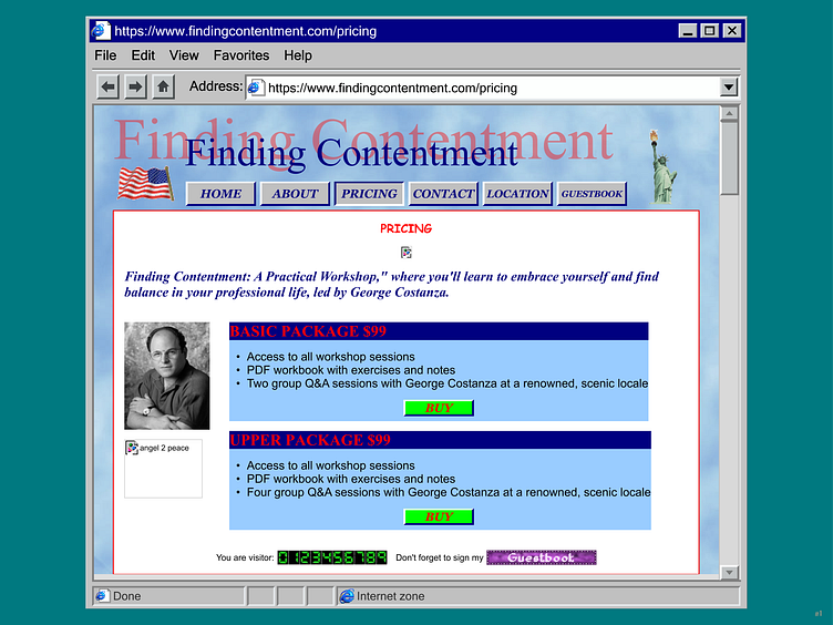
Step into the end of an era, where websites were as unpredictable as George’s job history. Sure, it’s a bit chaotic—multiple fonts, a classic broken image, and some unapologetically retro elements—but that’s what makes it a true Costanza creation.
Design Features:
Comic Sans, Arial, Times New Roman: Because George wouldn’t stick to just one font, and neither should we.
Retro Icons: A nod to the twilight of the golden age of the internet, with elements that scream late 90s nostalgia.
Broken Image: A happy accident, just like most of George’s career moves.
It’s About the Experience
Some might say it’s cheesy; we say it’s nostalgic. Some might think it’s outdated; we say it’s a perfect representation of a man who was always a bit out of sync with the world around him. The Finding Contentment Website isn’t just a webpage—it’s an experience, a time capsule, a love letter to an era and a character who encapsulates the absurdity of trying to find meaning in a world that’s always just a little bit off.
In conclusion, this site is meant to be fun, nostalgic, and a little bit ridiculous—just like George. It’s a reminder that in the pursuit of mediocrity, we might just find something unexpectedly delightful. So, let’s embrace the GIFs, the colors, and the chaos. After all, that’s what George would do.
