Mobile App Landing Page
💌 Have a website idea? Let's bring it to life together!
hello@ronasit.com | Telegram | WhatsApp | Website
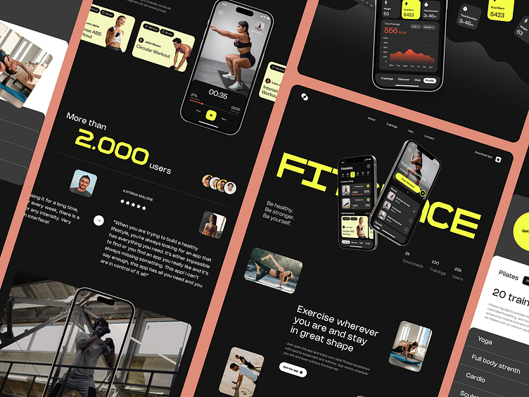
Hi everyone! Our team recently completed a design concept for a landing page for a fitness mobile app. Let's explore its design features.
The landing page starts with showcasing the app screens on the main banner, followed by sections highlighting the app's benefits, the content of fitness programs, a progress tracking screen, and user testimonials, all leading to a compelling CTA.
The design adopts a dark theme similar to the app, with contrasting yellow and orange accents to draw attention and add vibrancy.
A key characteristic of this design is its impactful presentation of the app screens and various exercise photos, effectively promoting the idea of engaging in fitness activities.


