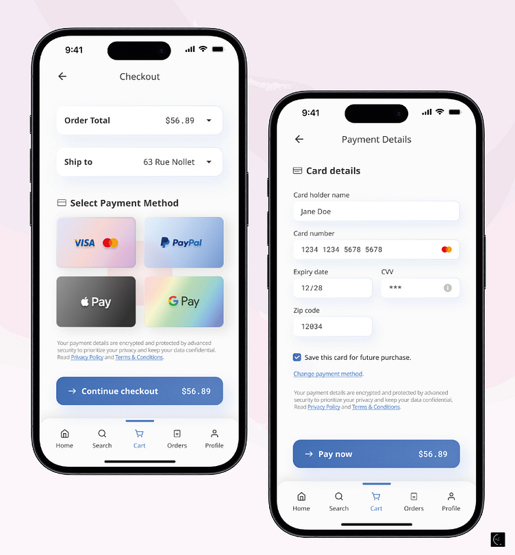
Credit card checkout
For today’s UI challenge, I decided to play around with the glassmorphism style and added some subtle shadow effects to give the design a fresh, modern look.While experimenting with new styles might not always fit a brand’s identity, I think it’s important to try out new ideas and push creative boundaries. When I design, I’m always thinking about the details—how the design works logically, how it feels to use, and how it can be accessible to everyone.
More by Silu View profile
Like
