🎨 Dashboard UI/UX Design 💻
Hello Dribblers !!
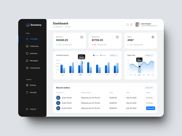
Excited to share my latest portfolio piece! This dashboard design focuses on delivering a clean and intuitive user experience, with a primary focus on key business metrics like revenue, expenses, and sales. The color scheme features a blue as the primary color, complemented by black and grey that brings balance and clarity to the data visualizations.
📊 Key Features:
Overview of key metrics for quick insights
Minimalist design with a white background and contrasting black sidebar
Interactive charts that make data easy to interpret
I aimed to create a design that's not only functional but visually appealing. Would love to hear your thoughts!
#UIDesign #UXDesign #DashboardDesign #Portfolio #Dribbble #DesignInspiration
More by Vahid View profile
Like


