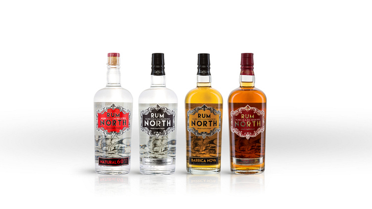
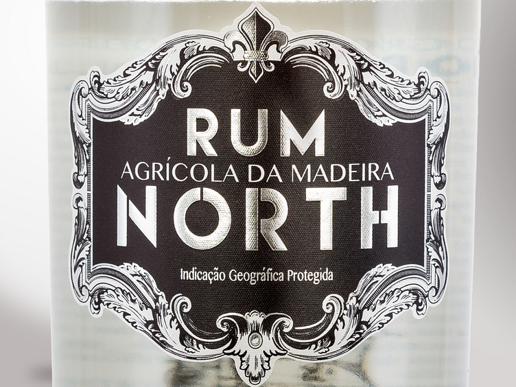
North Rum
A new line of RUM targeted towards a younger audience has been launched under a new name brand inspired by the distillery's location on Madeira Island's northern coast.
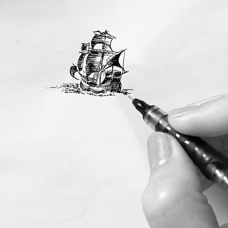
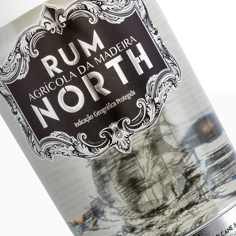
The lettering design showcases this cardinal point orientation and emphasises its verticality. The entire design concept centers around the Portuguese Discoveries Era and the daring adventures of sailors.
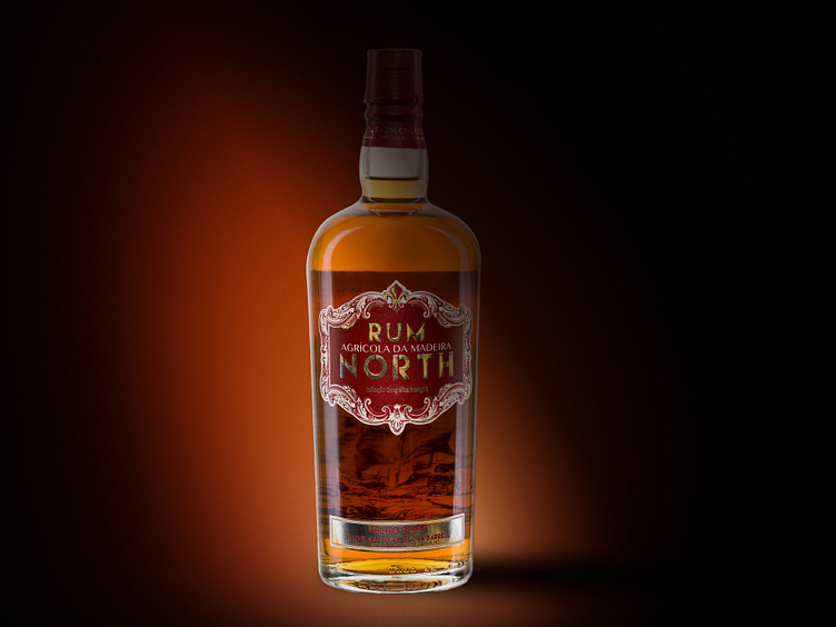
The main label features an elaborate frame inspired by the sea's waves, leaving ample space on the bottle for the ship to seemingly "sail" through the tumultuous waters.
The rum's various categories were assigned unique color schemes. The Natural rum, serving as the foundation for the other categories, was kept simple with a black and white design.
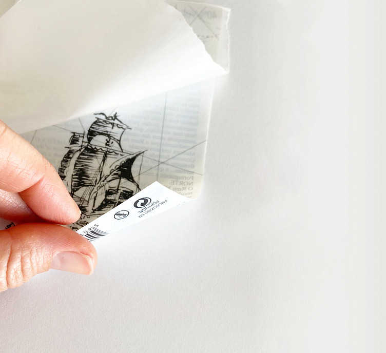
Designing the back label was a challenging task, as I needed to incorporate printing on both sides of the label to showcase the ship inside the bottle.