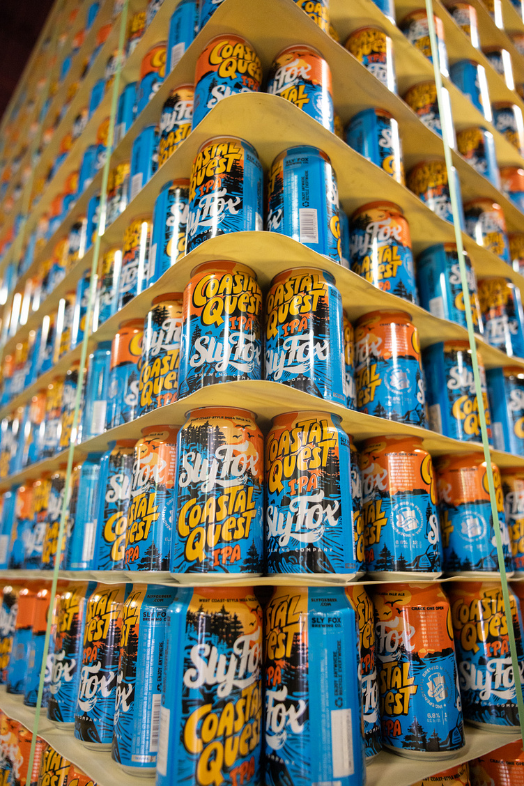
Coastal Quest West Coast-style IPA by Sly Fox Brewing Co.
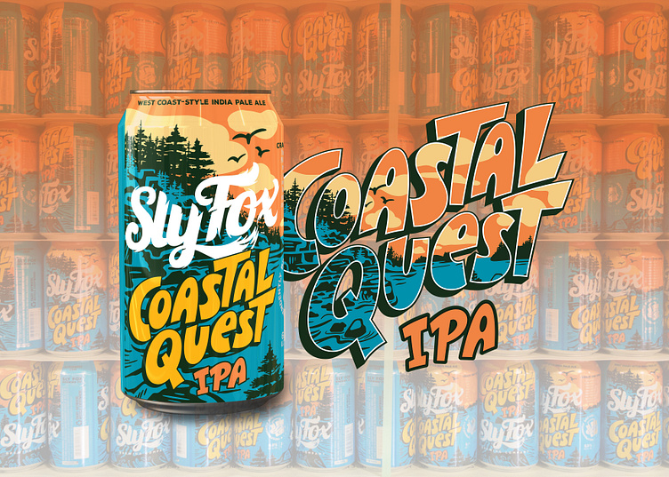
The search for your perfect IPA has come full circle. This treasure trove of flavor is teeming with the natural wonders of the Pacific Northwest. Unlock the pungent, hoppy notes of expressive pine and zesty citrus. A worthy reward, whatever your quest.
DESIGN SOLUTION
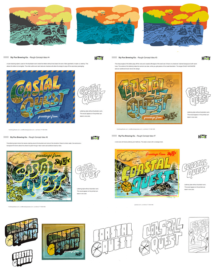
The creative process began with ideation of the name of the beer. During this open discussion, beer names were brainstormed alongside pitching the illustration work that would support the theme and marketing. Next, sketches were drawn both of the landscape coastal scene and the hand lettering of the logo that would ultimately be the focal branding element of the beer release. In a matter of seconds, packaging can inspire a customer to buy your product. For Coastal Quest, a packaging solution was designed that grabs your attention, clearly defines the style of beer and create a west-cost experience right in the palm of your hand when you reach for a can.
CREATIVE PROCESS & ART DIRECTION
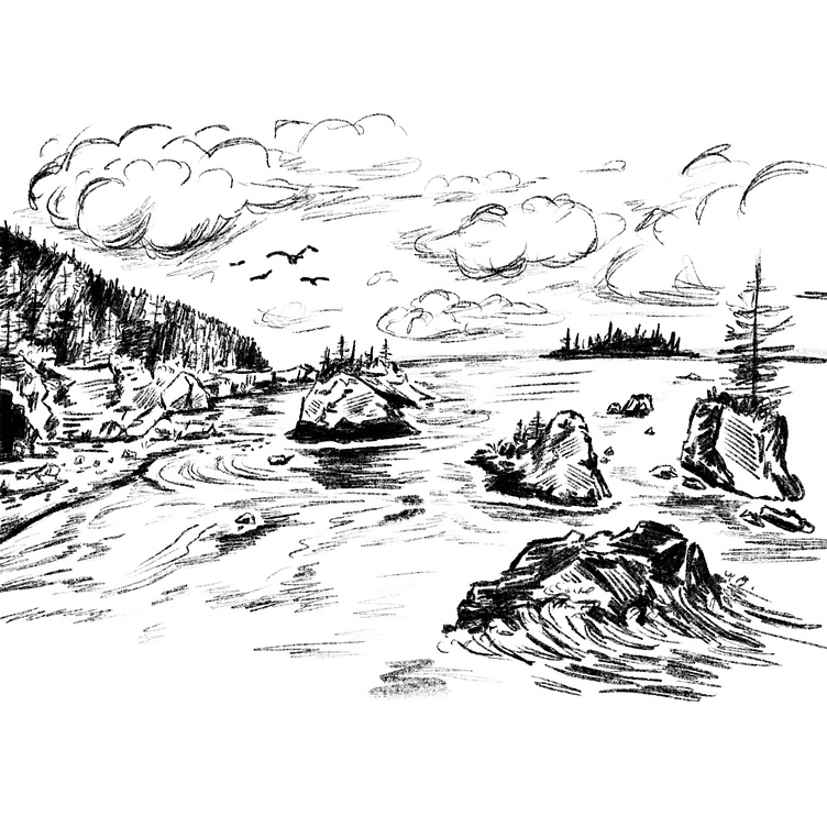
During the design process, thumbnail sketches are drawn out roughly to convey the concept and ideas. Rough colorways are explored parallel to the drawings to help show the final vision. Hand lettering concepts were sketched by Jeremy Friend working out the letterforms and composition of the type. Once a concept is selected both the illustration and beer logo are flushed out in finer detail and redrawn as vector graphics in Adobe Illustrator.
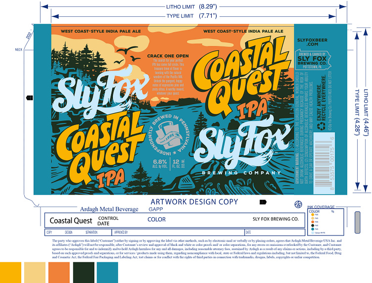
PRINTED CAN LABEL DESIGN
The beer can label comes together in Adobe Illustrator, focusing on the front and end panels of the label that will be visible when the can is sitting on the shelf. Keeping the laces out, all important information must be in this vertical space while also grabbing the customers attention, being clear and not overly busy. For a printed aluminum can, there are extra steps in the prepress setup to ensure text does not encroach into shrink areas of the can, proper bleeds are set, overlap on the can seam as well as setting up white layers for ink. A printed can uses a limited number of Pantone colors, and the illustration an artwork were carefully designed to accompany the design specs of printing with respect to the use of the shiny aluminum as an accent on type and graphics.
Hoot Design Studio
Illustration • Branding • Label & Packaging Design
www.hootdesignstudio.com | Follow along on Instagram
LET'S WORK TOGETHER
Email: Jen@hootdesignstudio.com