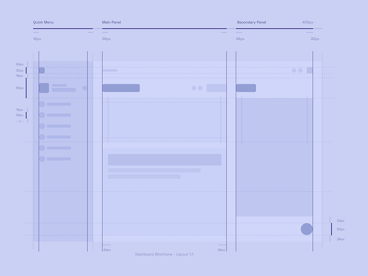
Taivult — Layout for dashboard
Hey! 💜
Sharing a wireframe layout for a dashboard design I'm currently working on. This blueprint outlines the structure and spacing for the quick menu, main panel, and secondary panel, ensuring a clean and organized interface. Precision in spacing and alignment is key to creating a balanced and user-friendly dashboard.
Would love to hear your thoughts on the layout! If you enjoyed this shot, don’t forget to like and comment.
🔗 Link to Case Study
Behance | Instagram | Dribbble
Have a project in mind? Let’s get to work.
Say hello@voit.team 👋
Thanks!
More by Voit Team View profile
Like
