Strong Tower Rebranding
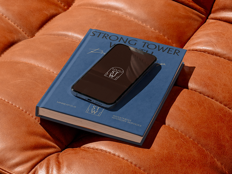
Strong Tower's rebrand features a simple monogram icon resembling a window overlooking a keep, the classic Adelon Serial for wordmark and headings, and a handwritten font for the tagline.
Elegant, castle-inspired patterns serve as background elements in various color combinations, while a nature-inspired color palette and minimalist layouts keep the focus on content.

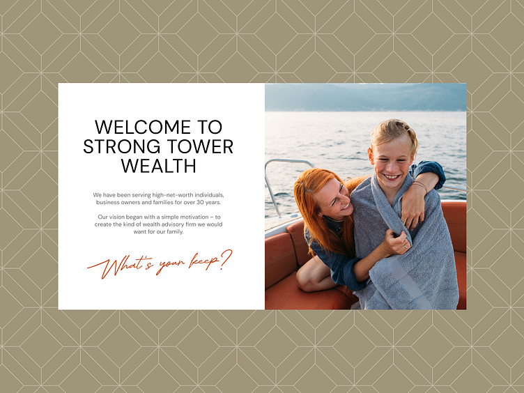

With this rebranding, we aimed to create the perfect balance for Strong Tower, making the brand both high-end and approachable. By integrating the concepts of family and legacy with a contemporary look, we ensured that the new identity reflects Strong Tower's commitment to long-term relationships and trust.
We are BB Agency
We are a partner for digital evolution, merging creativity and technology for holistic growth.
We join forces with companies dedicated to addressing real human needs. Leveraging our full-cycle digital capabilities, we shape brands, experiences, and products that enrich the lives of millions every single day.
Check us out at www.bb.agency