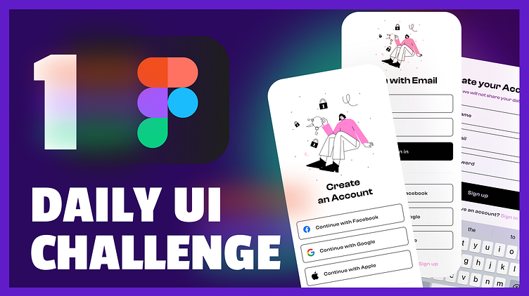
Daily UI Challenge #1: Sign Up
This is my first entry for the Daily UI Challenge, focusing on the sign-up process! 🎉
I designed a simple and clean sign-up form that makes it easy for users to create an account. The design includes clear input fields, a prominent sign-up button, and a user-friendly layout. Whether it's for a volunteer event, contest registration, or a giveaway, this form is versatile and intuitive.
Design Highlights:
Minimalist layout for a clutter-free experience.
Clear labels and placeholders for input fields.
Strong call-to-action button to encourage user sign-up.
Visual feedback for validation to guide users.
Want to learn more about the design process? I’m creating educational content for the Pakhton community to share knowledge about UI/UX design. Check out my YouTube channel where I explain each step of designing this sign-up form. My videos are in Pashto, aimed at helping others learn and expand their design skills.
Heading📺 Watch the tutorial on my YouTube channel
https://www.youtube.com/@welldux_official
Subscribe to stay updated with more UI/UX design lessons!

