De La Soul - Restaurant Brand Identity
Objectives:
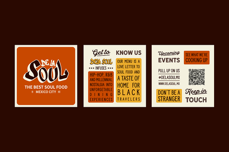
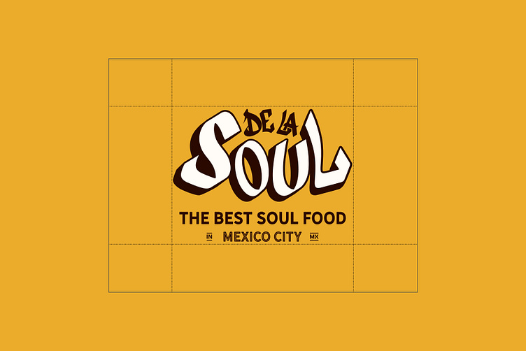
Rita and Tony reached out to Ulysses Design Co to collaborate on a fresh new brand Identity for their Soul Food Experiences in Mexico City. With roots in African American soul food and a twist of 80’s hip hop nostalgia we cooked up an authentic, fun, feel good identity.
Deliverables:
Logo Family
Type & Colour
Graphics
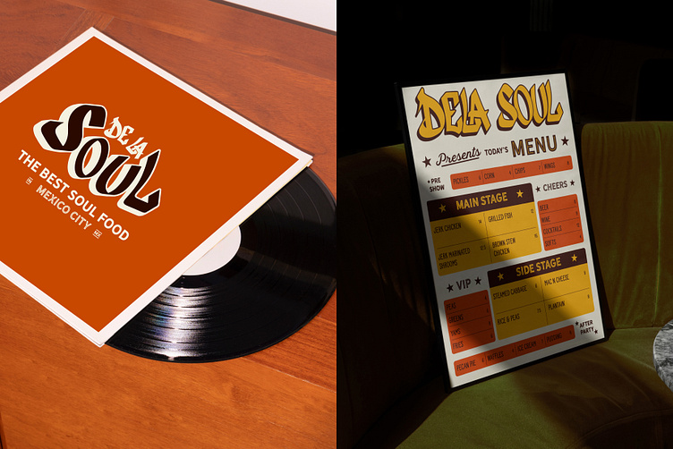
Collateral
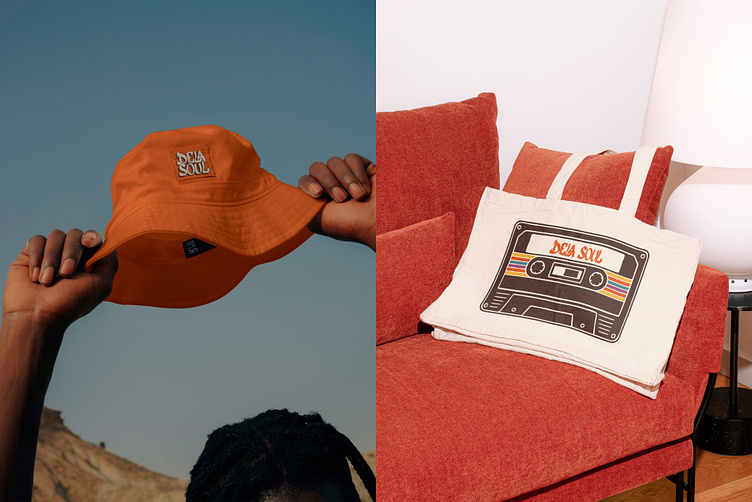
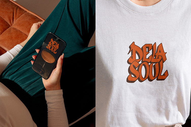
Merch
Brand Guidelines
Research:
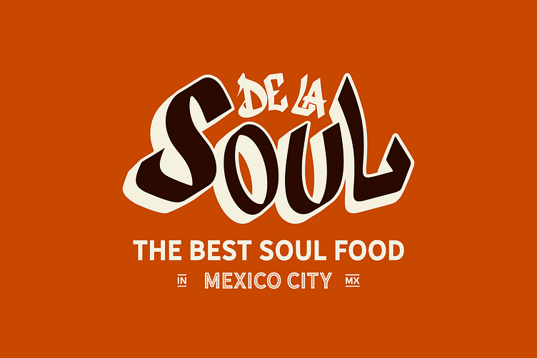
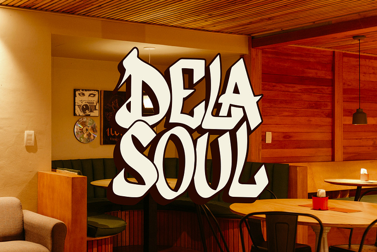
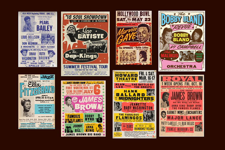
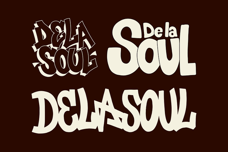
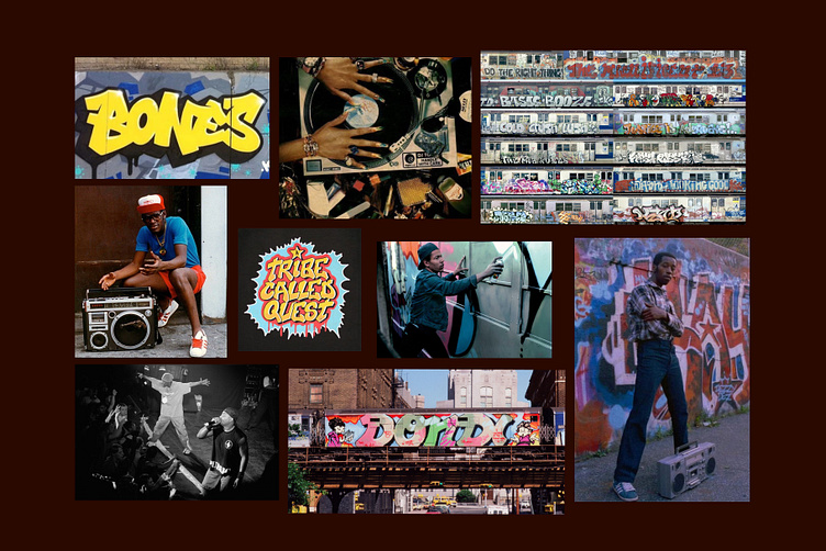
For the Logotype we looked back at the New York graffiti scene and cult films like Wild Style for stylistic reference. We also drew inspiration from vintage soul posters and colours from the 60’s and 70’s.
Solution:
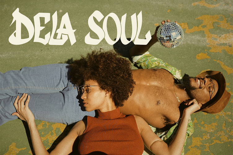
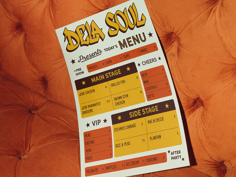
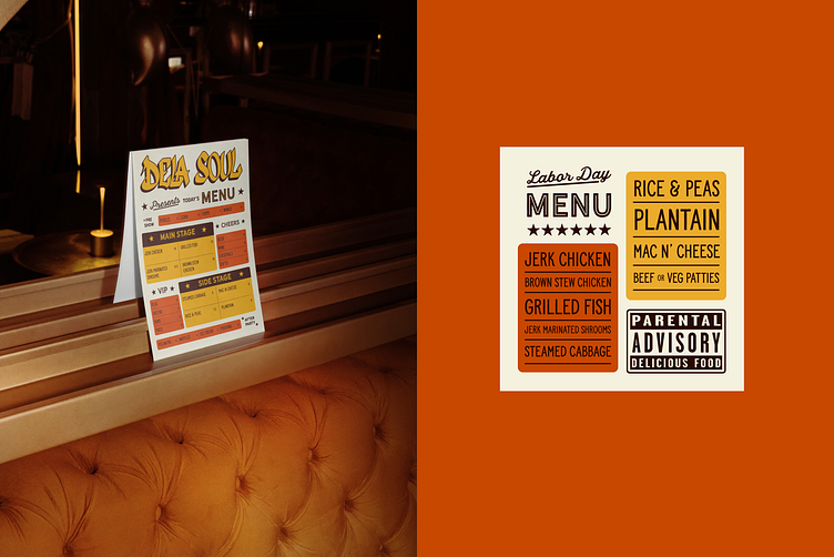
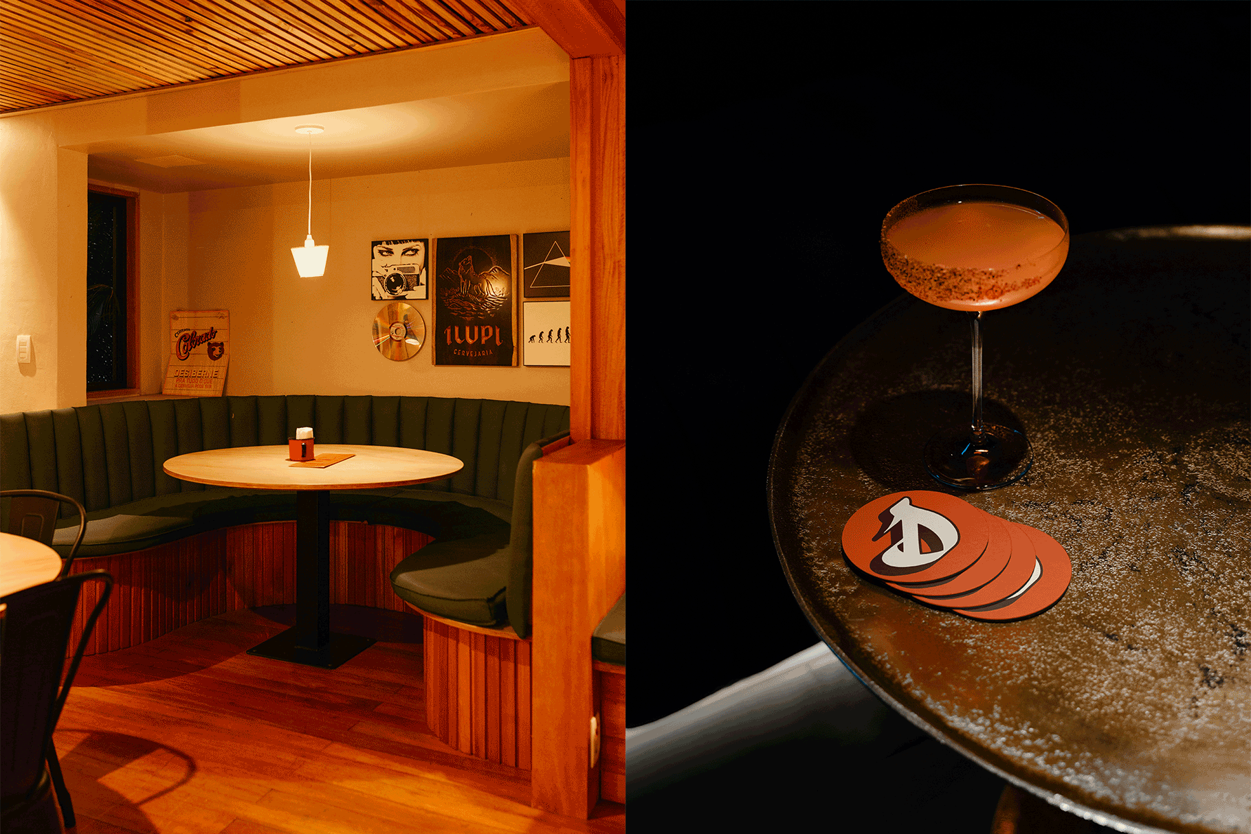
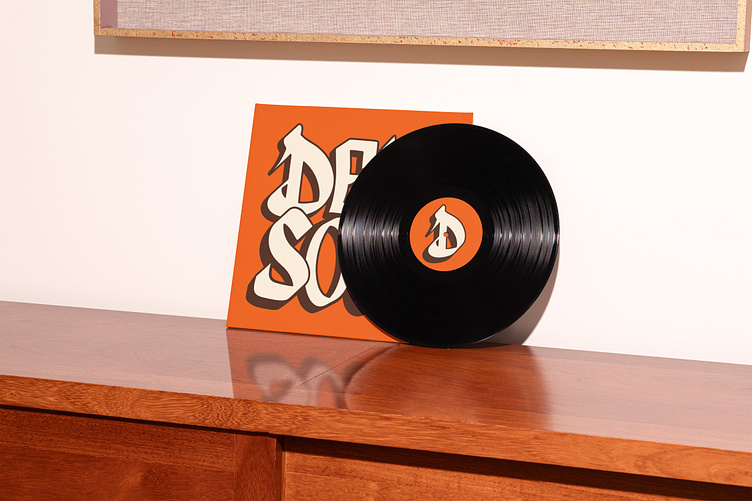
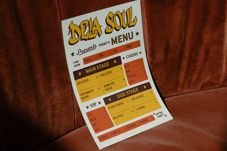
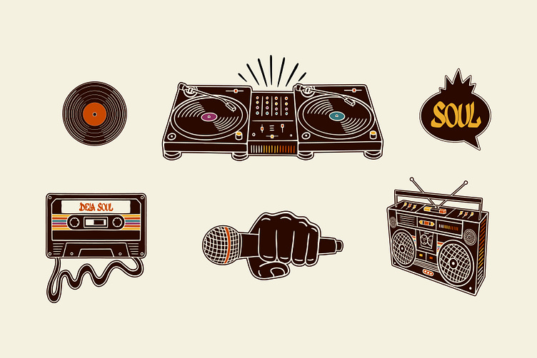
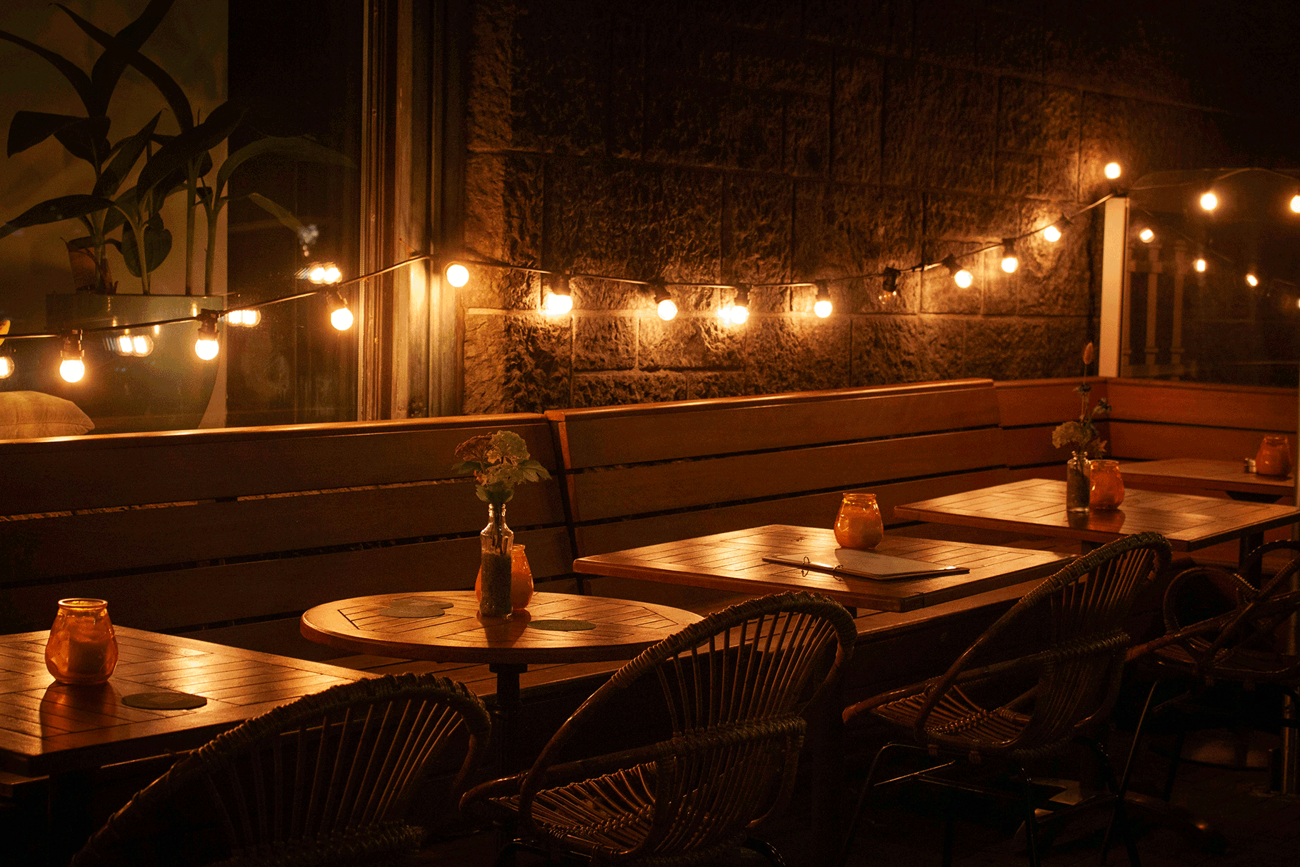
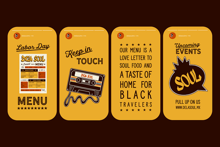
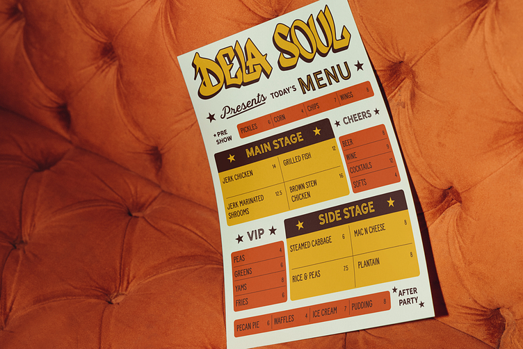
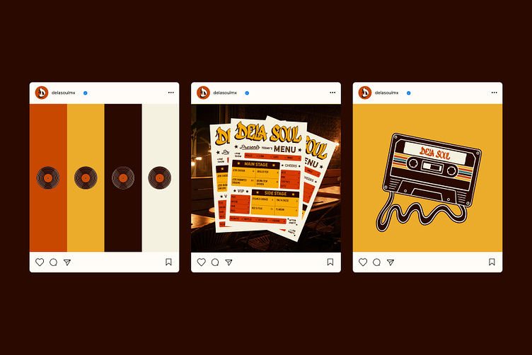
To create an authentic graffiti look we used a brush pen to hand draw the logo. Bouncy, interlocking letters that feel like they are grooving together and bold drop shadow to create depth. The hand drawn brand icons represent the elements of hip hop and create a cohesive identity that speaks to the soul. Included in the collateral is a CD insert, a fun play on the parental advisory sticker and cassette tape food card.

Results:
The results are a fresh and modern brand identity with a nod to black culture. Handing over the mic to the De La Soul crew, they now have the tools to really make their mark in Mexico City with their delicious soul food experiences. Being kid’s from the 80’s we personally loved working on this project and we hope you like it too!