QUY NHON PEARL | LOGO DESIGN & BRAND IDENTITY
Quy Nhon Pearl Homestay was born with the mission of providing a cozy and comfortable place to stay, bringing a wonderful resort experience to visitors. Not only that, Quy Nhon Pearl also creates a comfortable and close living space, helping visitors feel the peace and relaxation like in their own home.
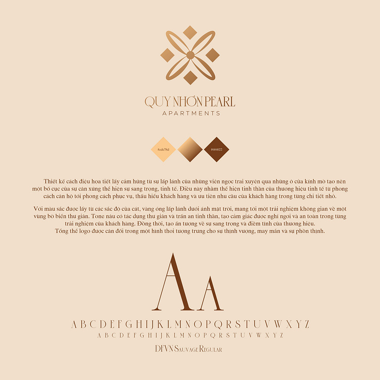
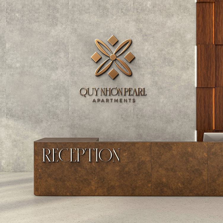
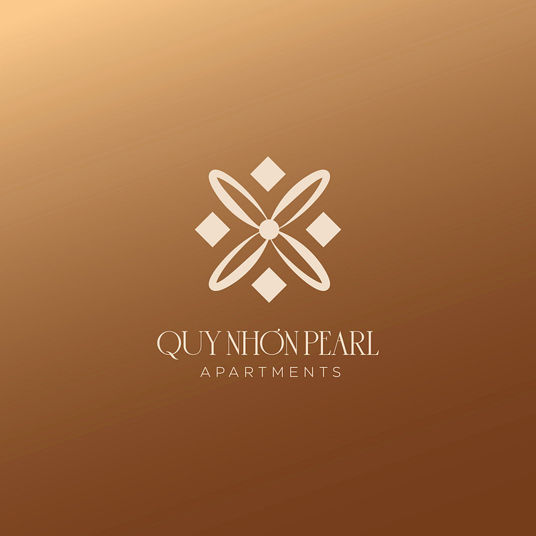
The brand identity of Quy Nhon Pearl homestay is designed using 2 main colors: gold and brown, taken from the shades of golden sand under the sun, bringing the feeling of a relaxing space by the beach. The brown tone enhances the feeling of relaxation, peace, bringing a sense of safety and rest in each customer experience. The combination of these 2 colors enhances the impression of luxury and sophistication of the brand.
The Quy Nhon Pearl homestay logo is designed with the idea of the sparkle of pearls through the glass windows, creating a solid and balanced layout. This shows the sophistication from the decoration style to the service attitude of the brand.
-
Client Quy Nhon Pearl
Logo Design Project. Logo is designed for Homestay.
Copyright© Bee Art. All Right Reserved
Contact us:
• Hotline/ Zalo: (+84) 77 34567 18
• Email: info@beeart.vn
• Website: www.beeart.vn
• Facebook: https://www.facebook.com/BeeArt.vn