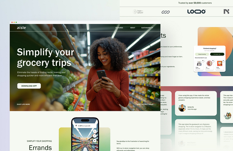
aisle - Mobile App Landing Page
Here’s an alternative design for the aisle landing page, where I’ve modified the approach to emphasize the user experience of the app. In this version, I’ve incorporated an image of the user experience, creating a more vibrant and relatable visual. While the overall aesthetic and goals remain focused on intuitive usability and connection to the grocery shopping journey, this design brings a fresh perspective to how users interact with aisle in their everyday lives.
More by Natalie View profile
Like

