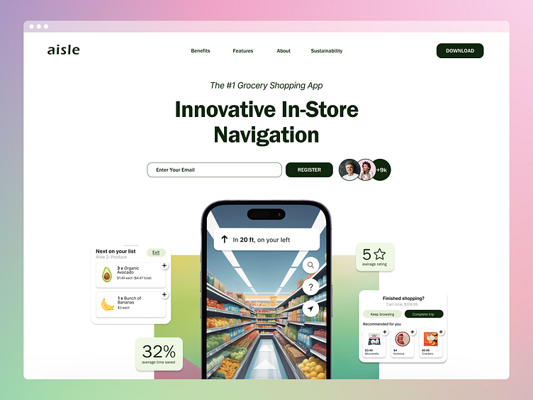
aisle - Mobile App Landing Page
Introducing My Latest Website Design, aisle
Shopping should be seamless, but often, it’s anything but. With a mix of user insights and innovative design, I’m thrilled to present a new grocery store navigation website mockup that transforms the shopping experience.
I chose a clean, minimalistic design to reflect the intuitive and user-friendly nature of the application. The green color palette was carefully selected to evoke the freshness and vibrancy of the grocery store's produce section, reinforcing the product's connection to healthy and natural choices.
After conducting five insightful user interviews—both over the phone and in person—I delved deep into understanding the true pain points of grocery shopping. Contrary to my assumptions, most people planned their ingredients in advance, even if they didn’t shop with a detailed list. Their frustrations varied, from the struggle of navigating crowded stores to forgetting key items. However, their overall attitude toward grocery shopping was surprisingly positive.
This product design isn’t just another grocery app. It’s a comprehensive tool tailored to ease the common pain points my users highlighted:
- Location Tracking for In-Store Navigation: No more wandering aimlessly. Find your items quickly and efficiently.
- Personalized Food Recommendations: Discover products you’ll love, based on your preferences and past purchases.
- Easy-to-Edit Shopping List: Never miss an item again, with reminders when something on your list hasn’t been checked off.
To ensure this product truly meets user needs, I also conducted a thorough competitive analysis, created two detailed user personas, and mapped out a comprehensive user journey. The result is a product that allows users to shop quickly, make informed decisions, and ultimately enjoy a smoother, more efficient grocery shopping experience.
