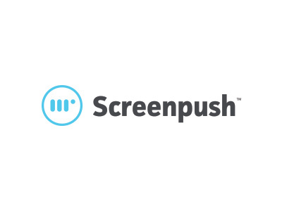
Screenpush - logo
Was given the opportunity to refresh an agency logo. Without straying to far from the original.
Thought process:
1. Update typography and font to feel friendly, honest, modern, bold
2. Vertically straighten the hand gesture
3. Brand mark to be a bit more clear it’s a finger pushing a button
4. Enclosed in a circle to represent a button
5. Add a color that is vibrant and recognizable
More by Keith Evans View profile
Like

