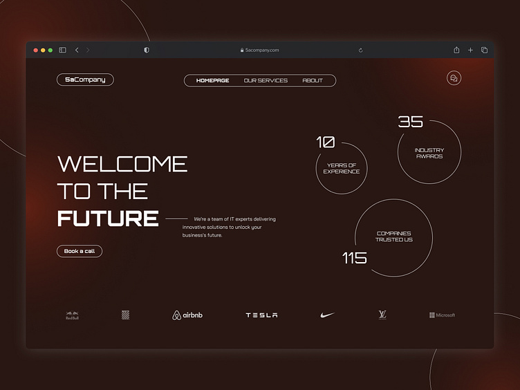
Tech Agency Website
The thought process behind it 🧐
✍🏼 This screen is designed to create a futuristic and innovative vibe for the user visiting the website, targeting startups and companies seeking IT-related services.
🎨 The darker theme, often associated with developers and tech, is paired with circular red gradients to draw attention to key sections of the design.
🪄 Social proof and intuitive navigation are the pillars of this hero section, emphasizing the company's experience and reliability.
More by Pedro Nazário View profile
Like

