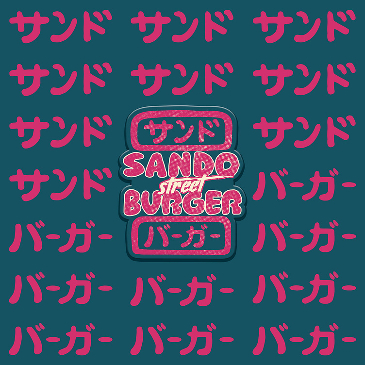
Sando Street Burger
Proudly present to all of you my latest work with newest sandwich store in town, Sando Street Burger.
Two-tone alternate logo.
Basically, I used 2 colours as the main colours. Pink and Blue, because the owner wanted something different and a bit crazy.
Enter your texAnd this is the application of the logo on the pattern used for the wrap.
Last but not least, I also created a menu that will be displayed on the TV when customers place their orders.
More by Hanan Ravaie View profile
Like


