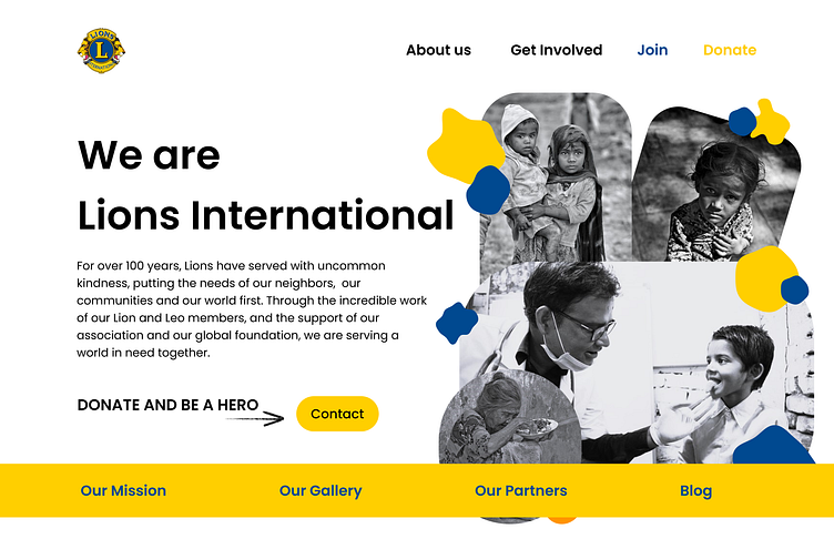
Landing Page - A Test design for Lions International Club
Context ....
One of my mom's colleague asked me if I can able to make a test design of a single landing page for the lions international club, and I said "YES" and made this design within a night ;)
While developing this design I went back to search a particular asset in figma, where I saw my old designs in the draft which I developed during my early stages of learning the UI/UX designing.
To be honest, even though those designs are not up to the current mark, but "for me" those are some great designs which I personally feel great about and say "yeah man, you are not that bad in designing" during that time and even now.
so the point which I am trying to make here is, don't compare your work with others... compare your work with your past-self, and ask yourself that, whether "your current-one is better than your past-one" - have a great day ...
If you feel this design is Good , Motivate me with a Like 👍.
───── ⋆⋅☆⋅⋆ ─────
📩 For contacts :
Email: madhannmady@gmail.com
LinkedIn: Madhan kumar K
© Madhan kumar K
