Branding Design for Canna Health
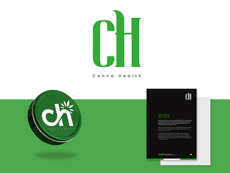
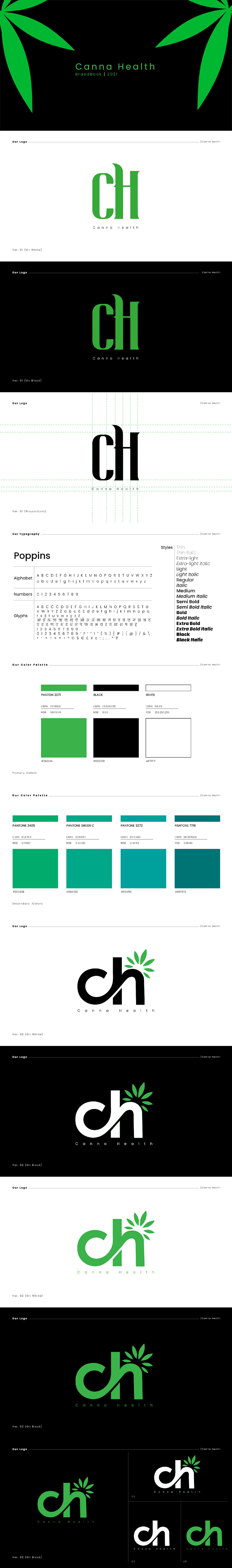
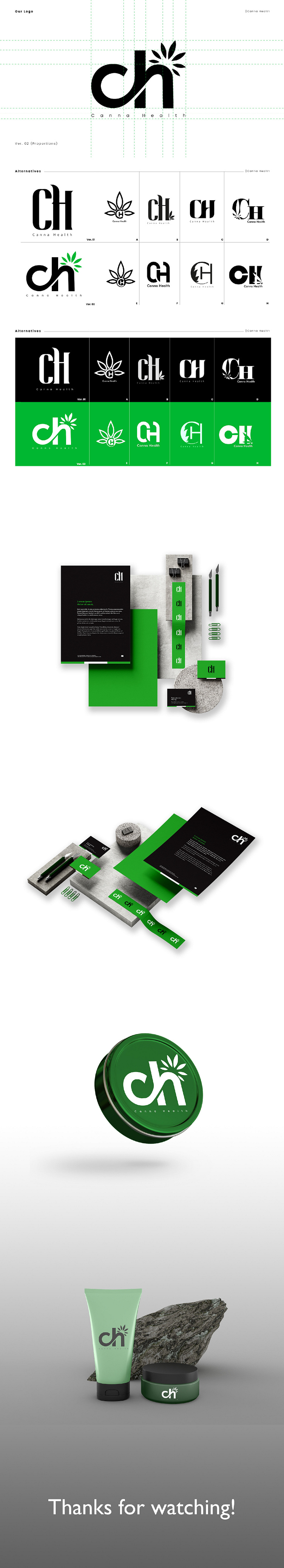
Canna's lettermark logo and branding are thoughtfully designed to reflect the essence of the cannabis industry while emphasizing its healthcare focus. The logo features a sleek, modern font that centers on the brand name, ensuring immediate recognition. The color palette that have been used, evokes a sense of nature and wellness. This simplicity makes the logo both eye-catching and memorable, aligning perfectly with Canna's mission of promoting natural health solutions.
The branding assets designed for them include:
- Logo Usage
- Colors
- Clear Space
- Icons
- Fonts
This cohesive branding approach effectively communicates Canna’s dedication to healthcare and natural solutions.
Contact us today for your full branding designs!