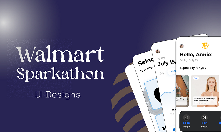
Walmart Sparkathon - My UI Designs
Onboarding ...
Users are allowed to integrate with their favorite third party fitness application and sync their data with our application.
Home Page
After Syncing data successfully, users are displayed with a clear and at the same time, visually appealing ,well processed information about their fitness related data.
Stats Page
Well detailed and categorized stats section which helps the users to navigate and choose exercise options which suits them best.
Product Page -1
AI based product suggestions are given to the users, thanks to the users data which are obtained from the third party fitness applications
Product Listing
Detailed product information like price, product name, product details and necessary buttons like add-to-favorite and add-to-cart are implemented in this section.
Community Page
This is where the discussions takes place, similar to reddit, Quora people can create and also interact with the community forums of their interest.
Community Interactions
This is how the interactions in the community will look and be, users can search or categorize the community messages based on community names or using the hastags.
Additional designs
First Image displays some key micro interactions in the community forums and remaining last two images displays additional information about how the product is categorized.
If you feel this design is Good , Motivate me with a Like 👍.
───── ⋆⋅☆⋅⋆ ─────
📩 For contacts :
Email: madhannmady@gmail.com
LinkedIn: Madhan kumar K
© Madhan kumar K


