Kreativ™ - Logo & Branding for Uber valet parking Brand - Tech
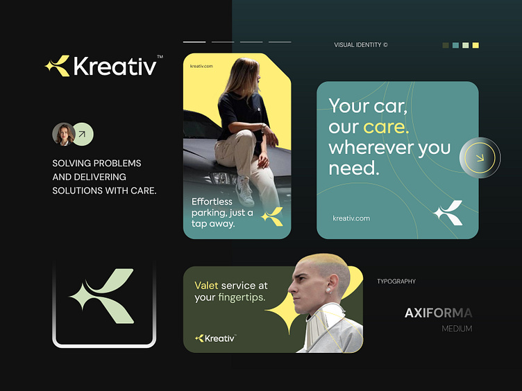
I'm excited to share that I've just finished the branding project for Kreativ, an Uber valet parking brand focused on delivering smooth and reliable services.
The design process was both challenging and rewarding, and I'm happy to say that my client is thrilled with the final result. Their excitement makes all the hard work worth it!
Concept: Alphabet " K "+ Star
Color Psychology: Yellow and green are perfect for a valet parking brand. Yellow stands out, symbolizing visibility and safety, which are key for a smooth parking experience. Green represents trust and efficiency, reflecting the brand's commitment to reliable and eco-friendly services. Together, they create a welcoming and secure feel.
Press "L" to show your love ❤️️
______________________________________________________________________________________________
👉 Say goodbye to ineffective logos and hello to a design that’s both memorable and recognizable!🌟
📩 Available for new projects :
Email: info@rahidrehman.me
WhatsApp: https://wa.me/+8801705553455
Telegram: @rahiddesigner
💡 Follow for more update: Dribbble, Behance, Instagram, Twitter, Linkedin
© Rahid Rehman