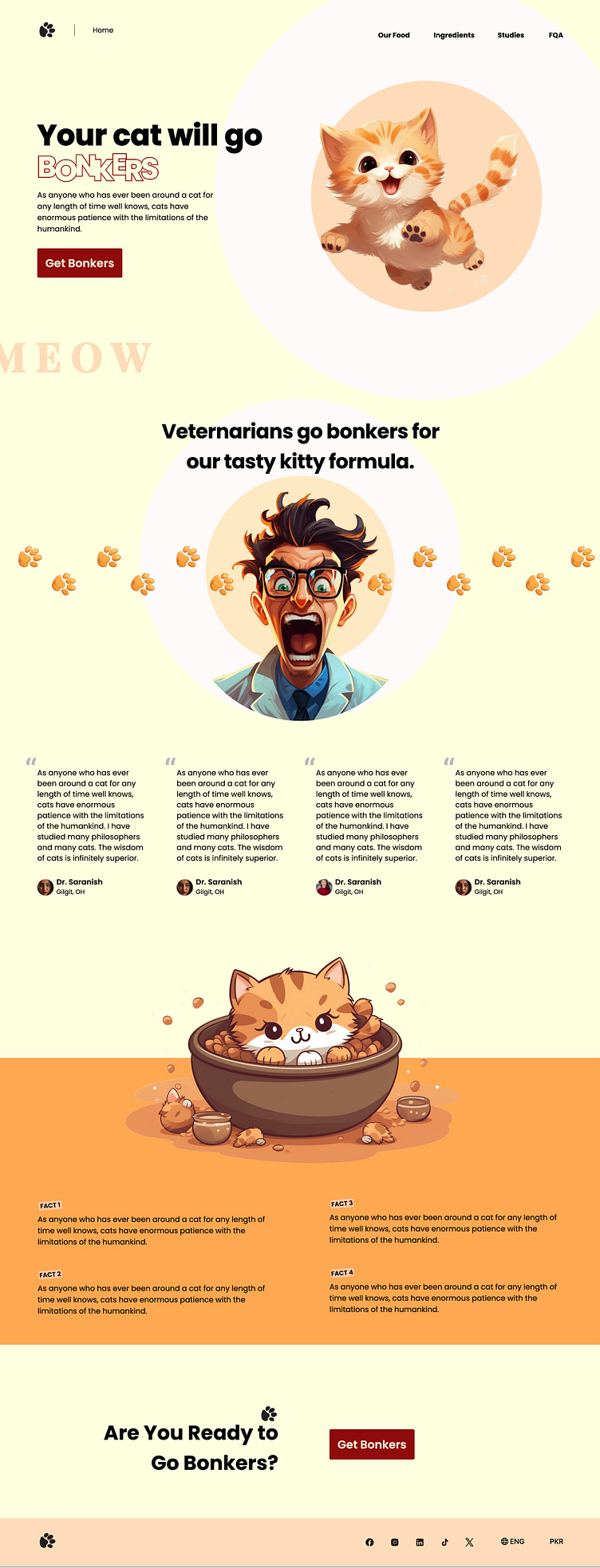
Get Bonkers - The Ultimate Cat Experience
Project Overview: "Get Bonkers" is a whimsical and engaging landing page designed to captivate cat lovers and provide them with a delightful online experience. The concept behind this project was to create a platform that not only showcases the charm and quirks of cats but also highlights their playful and enigmatic nature.
Objectives: The goal of "Get Bonkers" was to design a visually appealing and user-friendly landing page that could serve as a promotional site for a fictional cat-themed product or service. The focus was on creating an immersive experience that would resonate with the target audience—cat owners and enthusiasts.
Design Approach: The design of "Get Bonkers" combines vibrant colors, playful typography, and charming cat illustrations to create a lively and inviting atmosphere. The layout is clean and intuitive, ensuring that users can easily navigate through the content. Special attention was given to the use of whitespace, allowing the playful elements to stand out without overwhelming the viewer.
Key Features:
Hero Section: The hero section immediately grabs attention with a dynamic image of a cat mid-pounce, embodying the energetic spirit of the brand.
Interactive Elements: To keep users engaged, interactive features like hover effects and animated transitions were incorporated. These subtle animations add a layer of fun and excitement to the browsing experience.
Content Sections: The content is organized into digestible sections that highlight the key benefits of the product/service, supported by catchy headlines and concise copy.
Call-to-Action: A prominent and persuasive call-to-action button encourages users to take the next step, whether it's signing up, purchasing a product, or exploring more about the brand.
Challenges & Solutions: One of the challenges was to balance the playful aesthetic with a professional look, ensuring that the page appeals to a wide audience. This was achieved by using a consistent color palette and typography that aligned with the brand’s identity, while still allowing room for creative expression.
Conclusion: "Get Bonkers" successfully blends fun and functionality, creating a landing page that not only entertains but also effectively communicates the brand's message. This project reflects my ability to design with the end-user in mind, while also showcasing my skills in creating engaging and visually appealing digital experiences.
Tools & Techniques Used:
Adobe XD for wireframing and prototyping
Adobe Photoshop and Illustrator for graphic design
CSS animations for interactive elements
Project Outcome: This project demonstrates my capability in creating a cohesive and compelling digital experience, which is both user-centric and visually striking. "Get Bonkers" is a testament to my design philosophy of combining creativity with usability to deliver impactful results.
